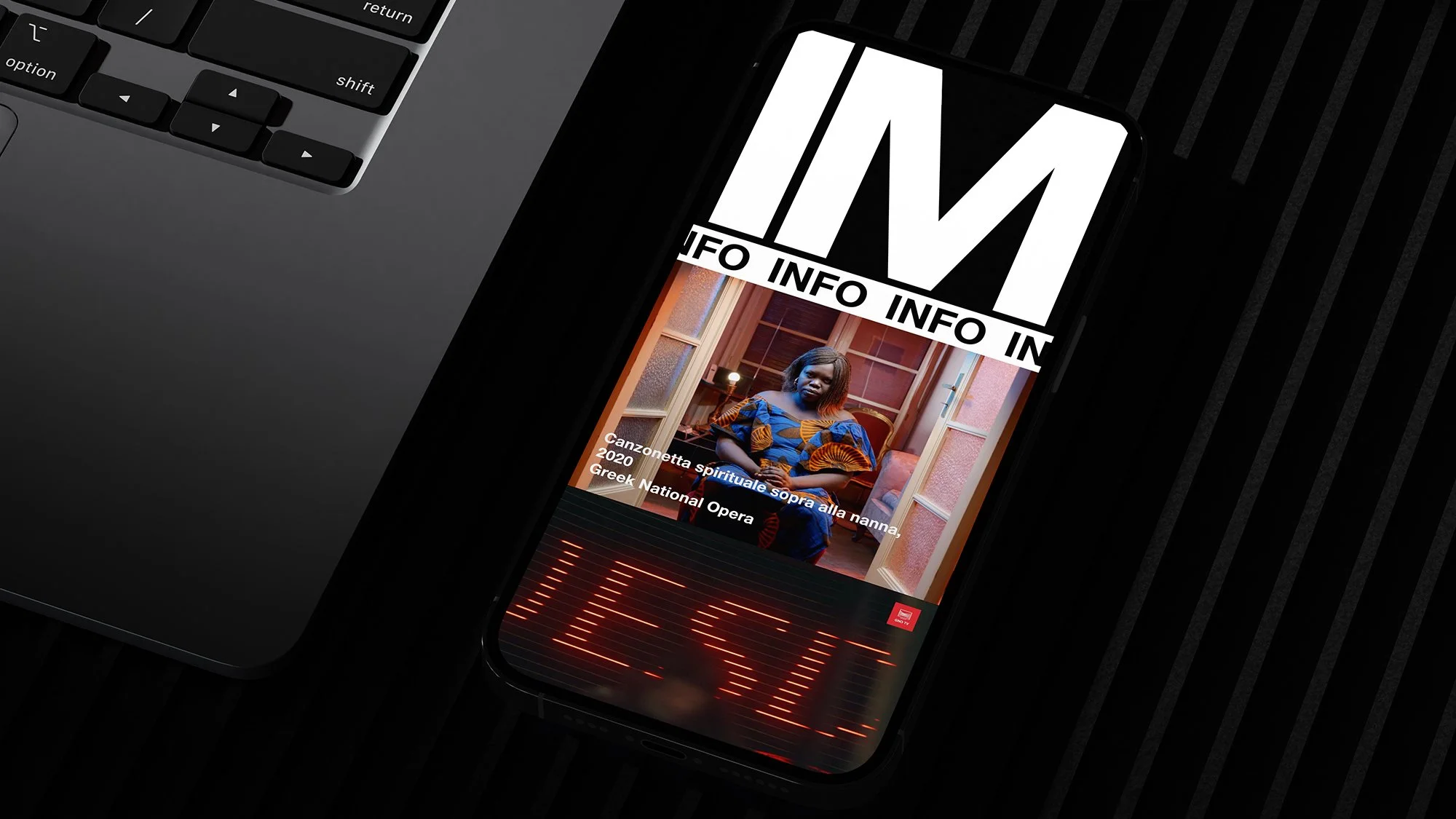
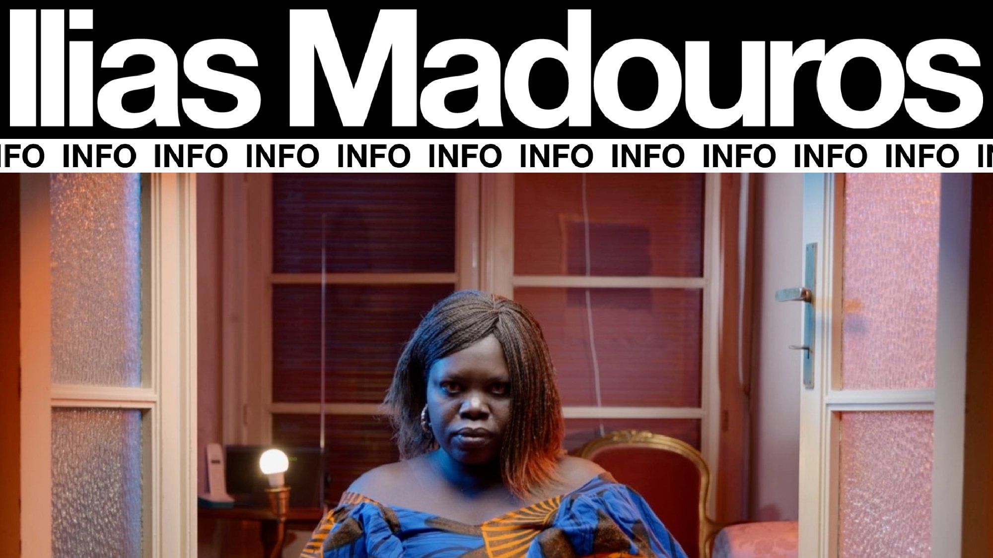
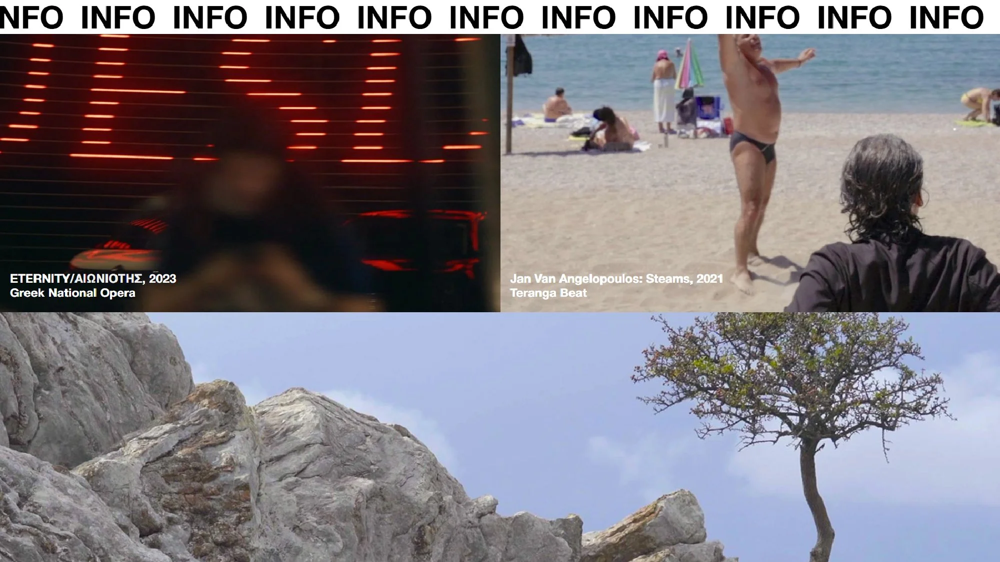
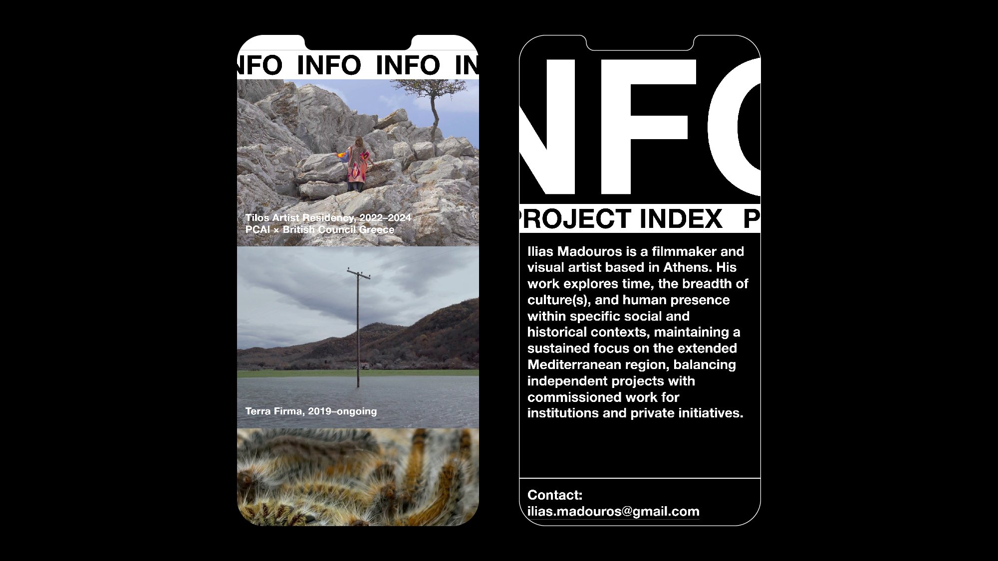
The design is primarily based on the use of big, expressive, moving type (in the form of scrolling marquees), both for the page titles and the basic navigation, as a direct reference to the moving image and the element of time that characterises it.
Along the same lines, negative space is kept to a minimum in all of the layouts, largely omitting any empty space between elements (margins/padding) so as to create a more visually dense result, and an increased sense of linear narrative while scrolling.