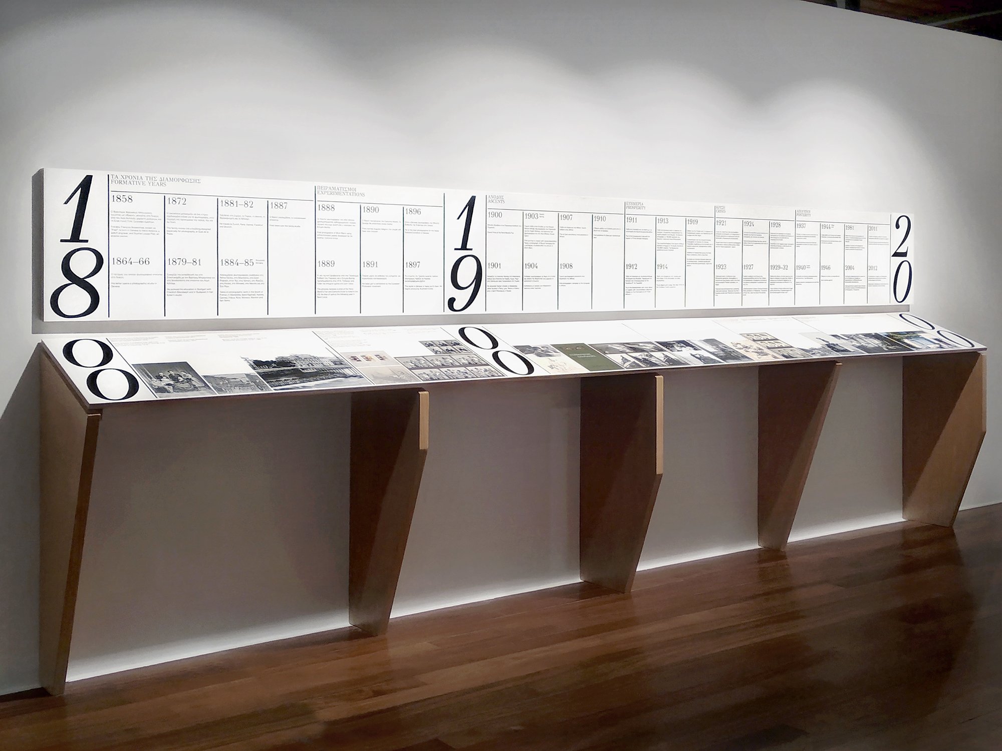
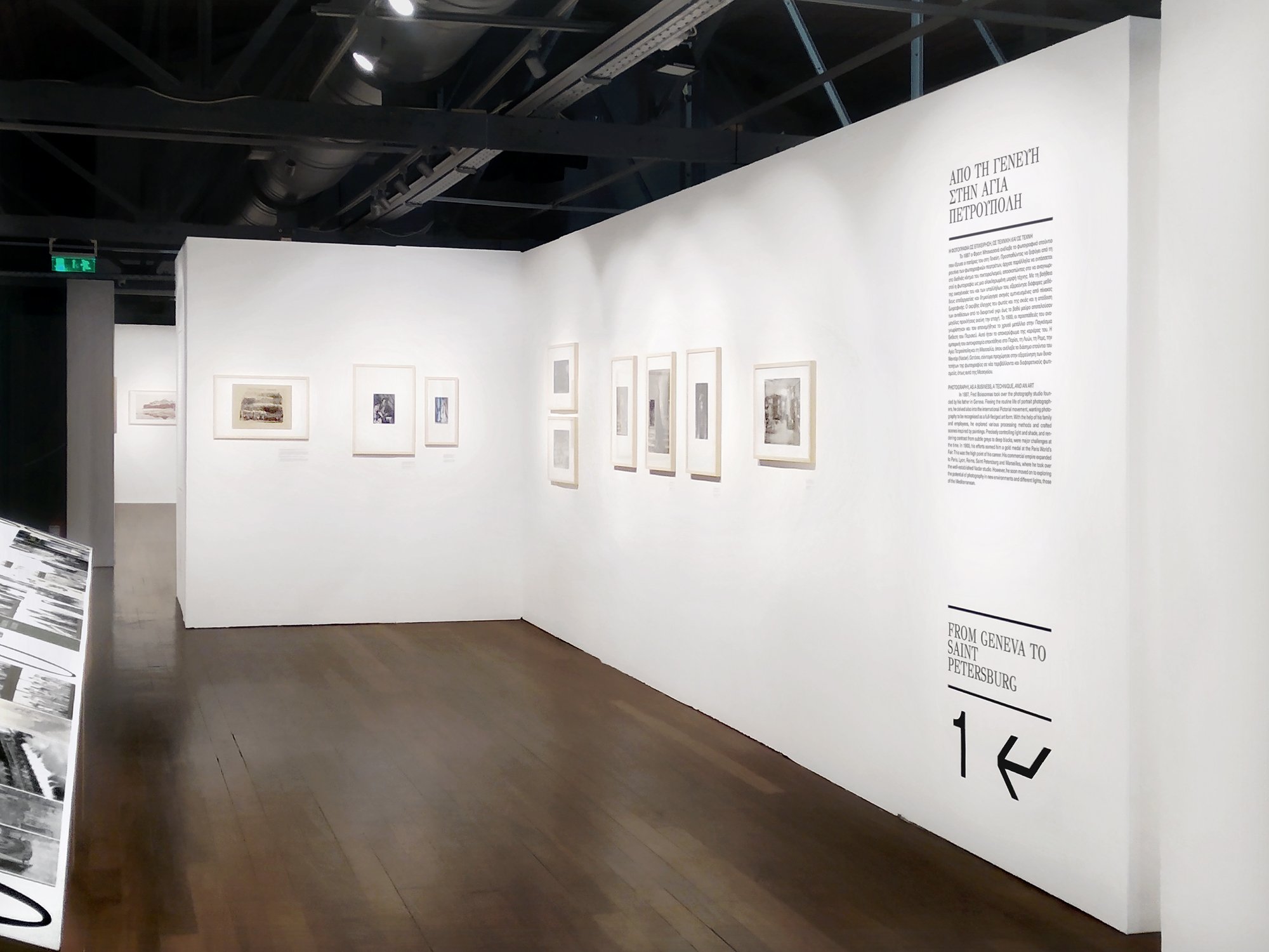
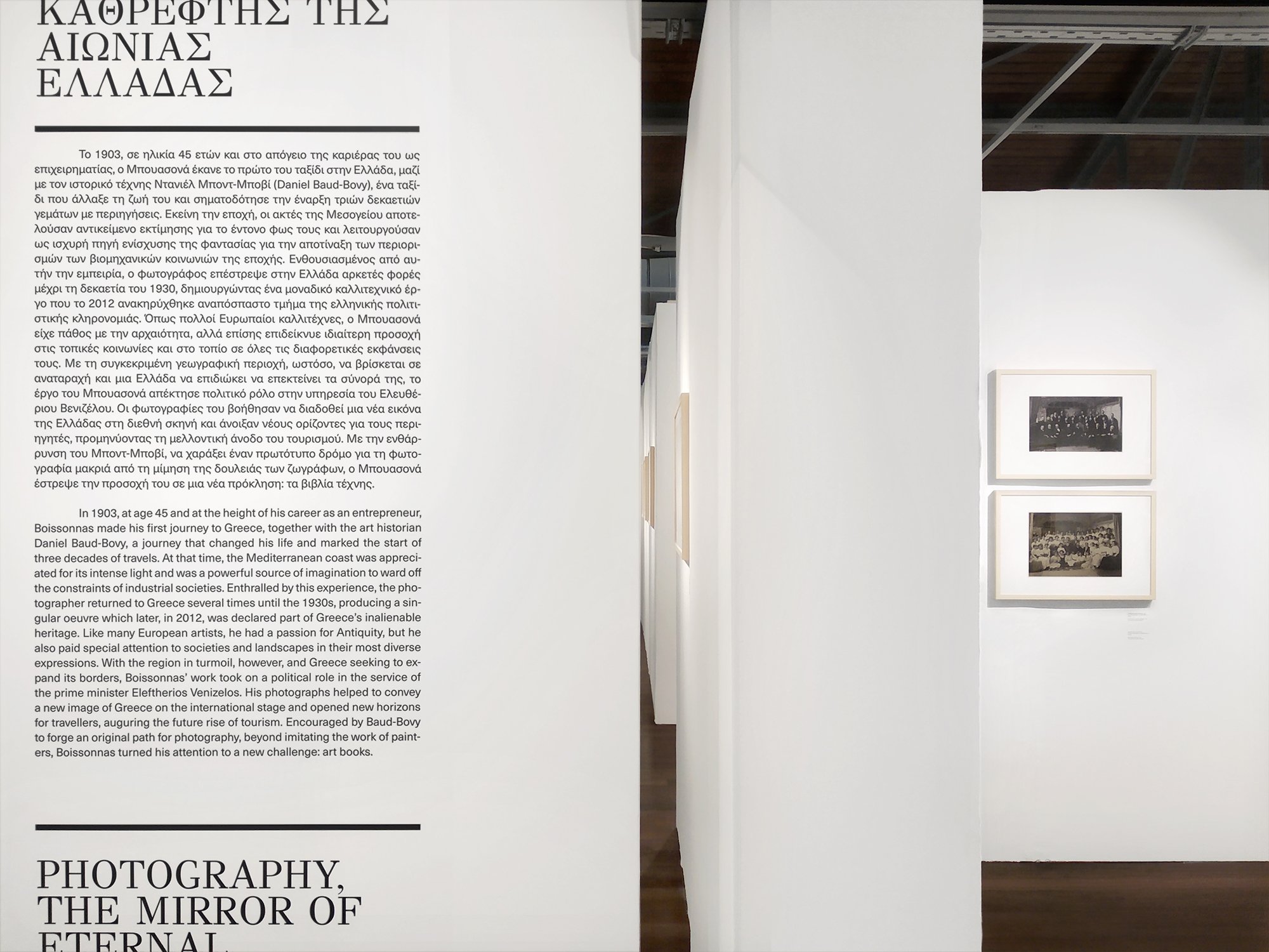
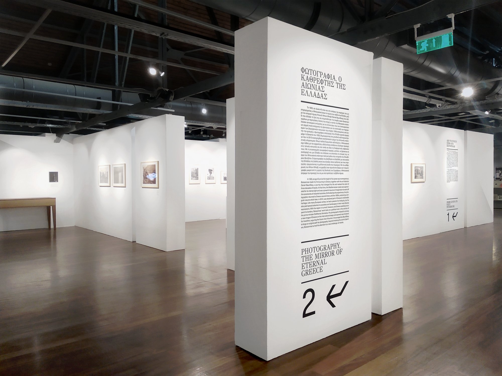
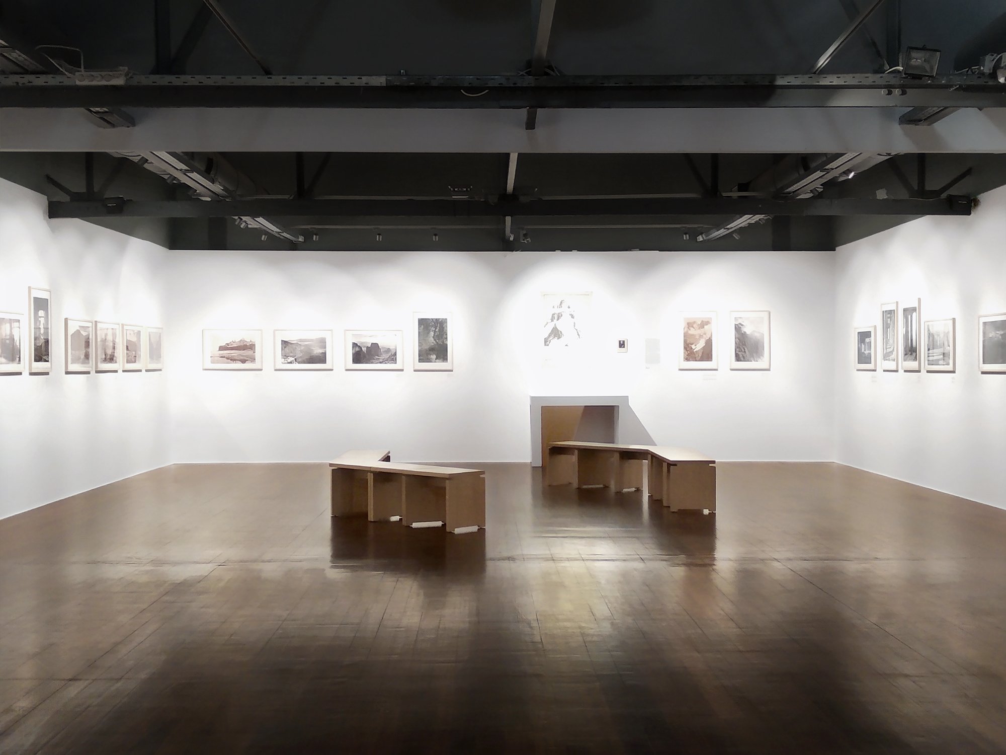
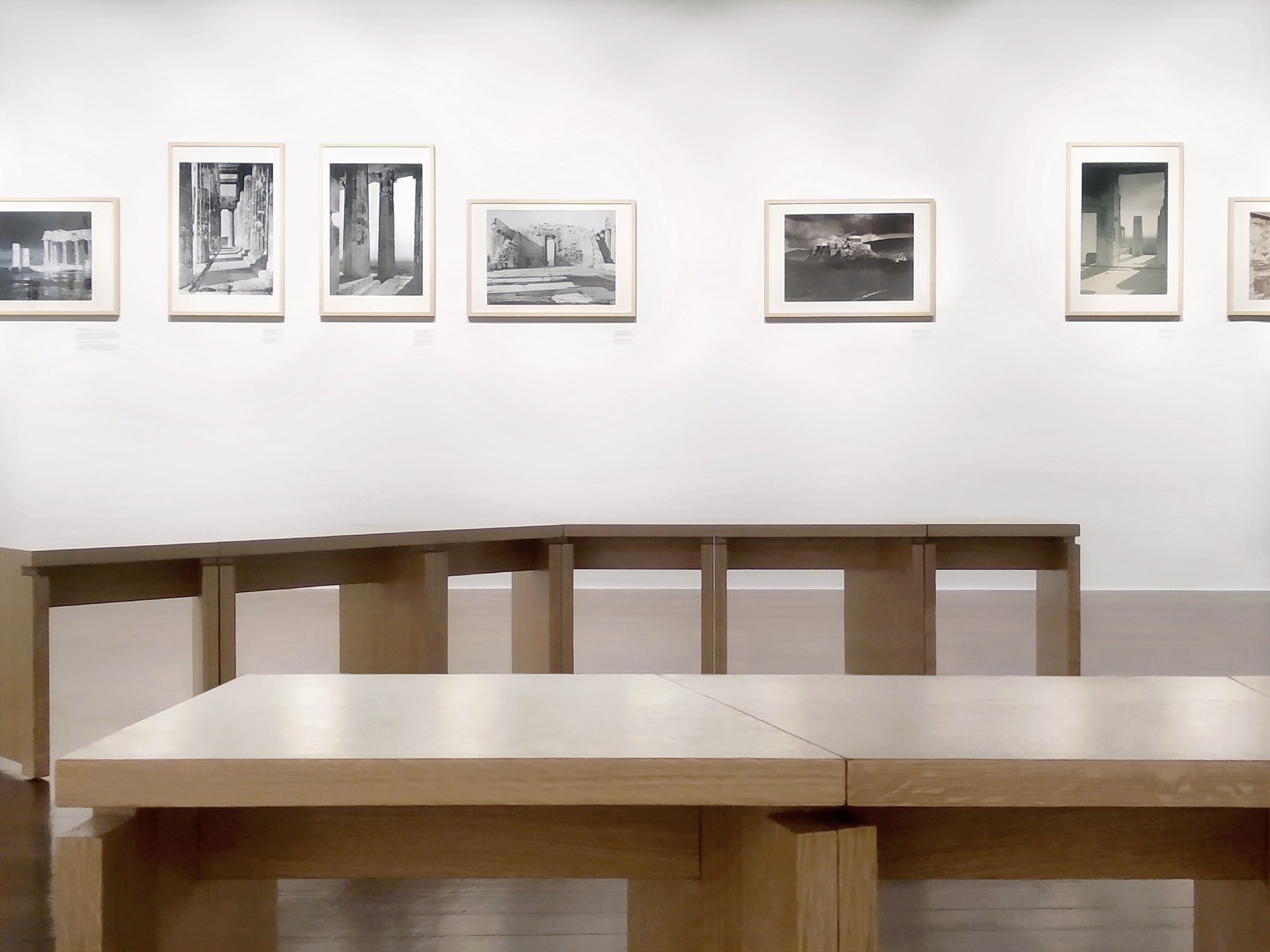
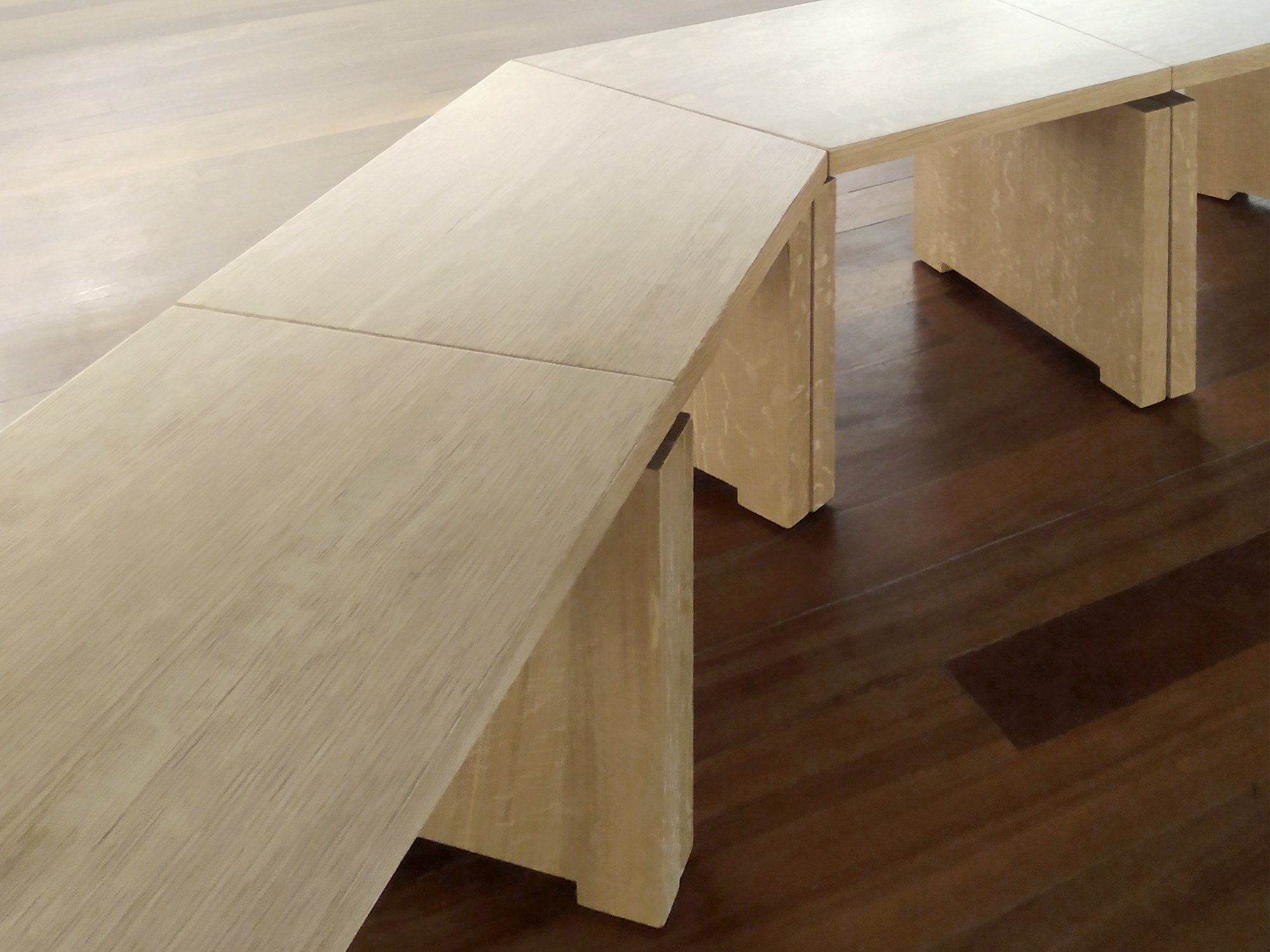
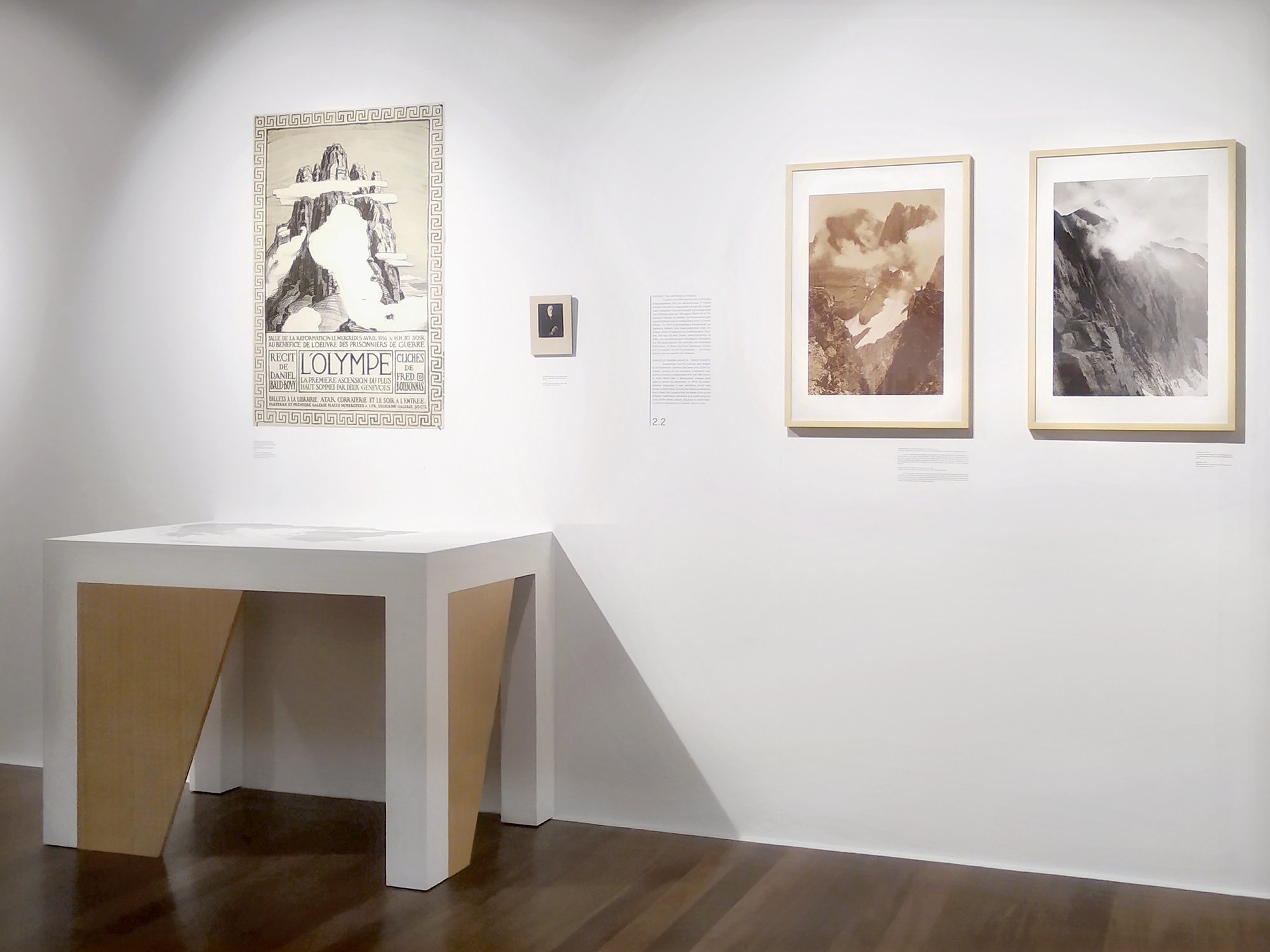
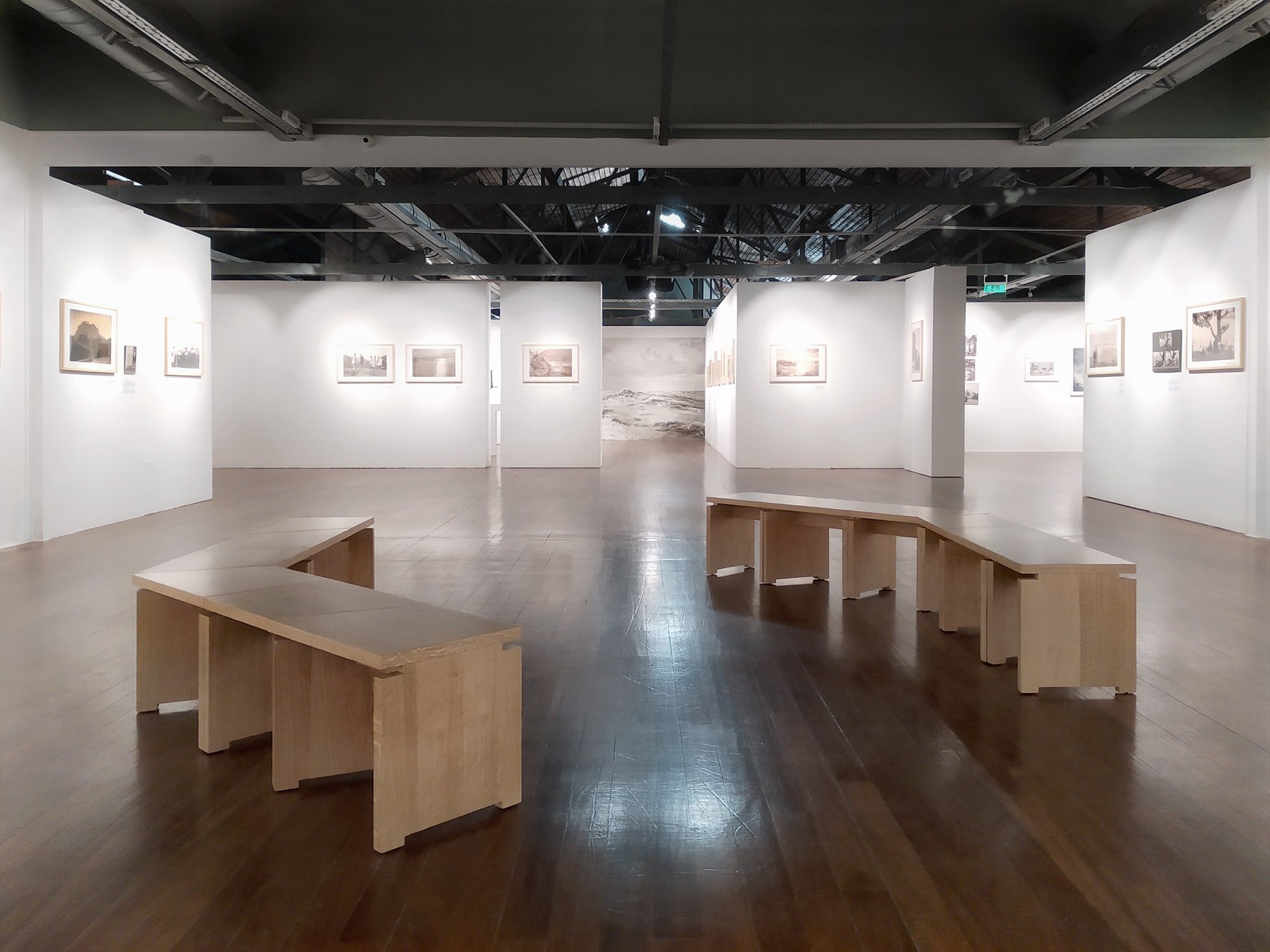
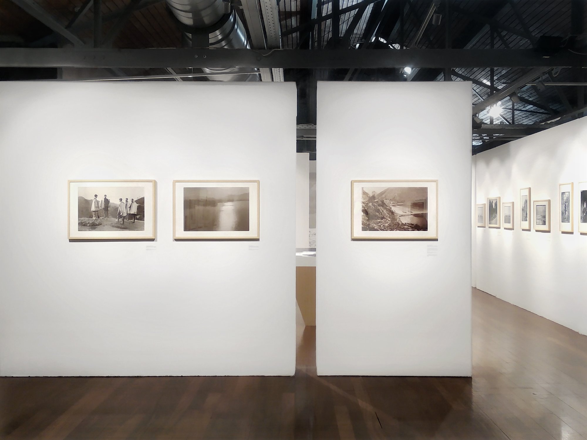
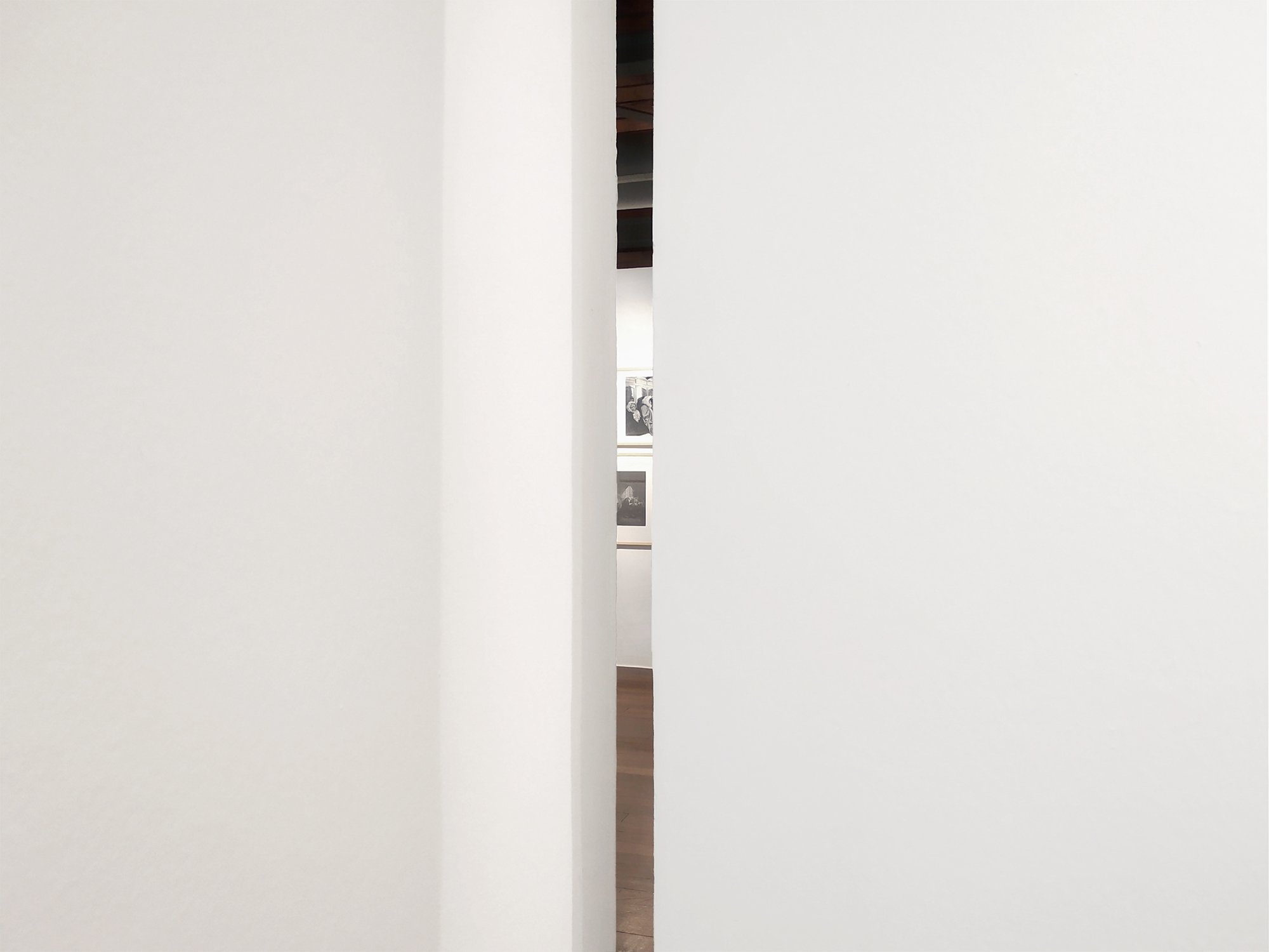
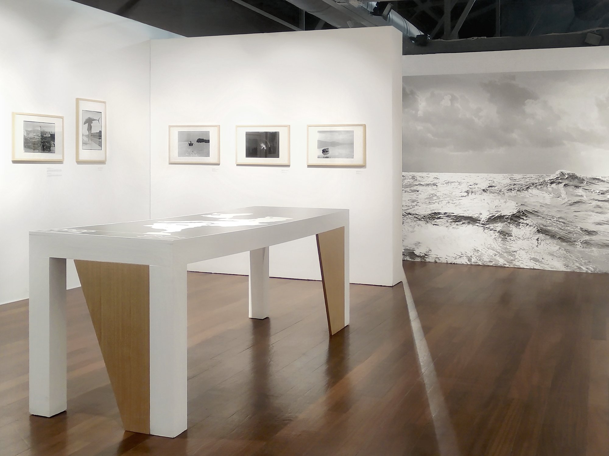
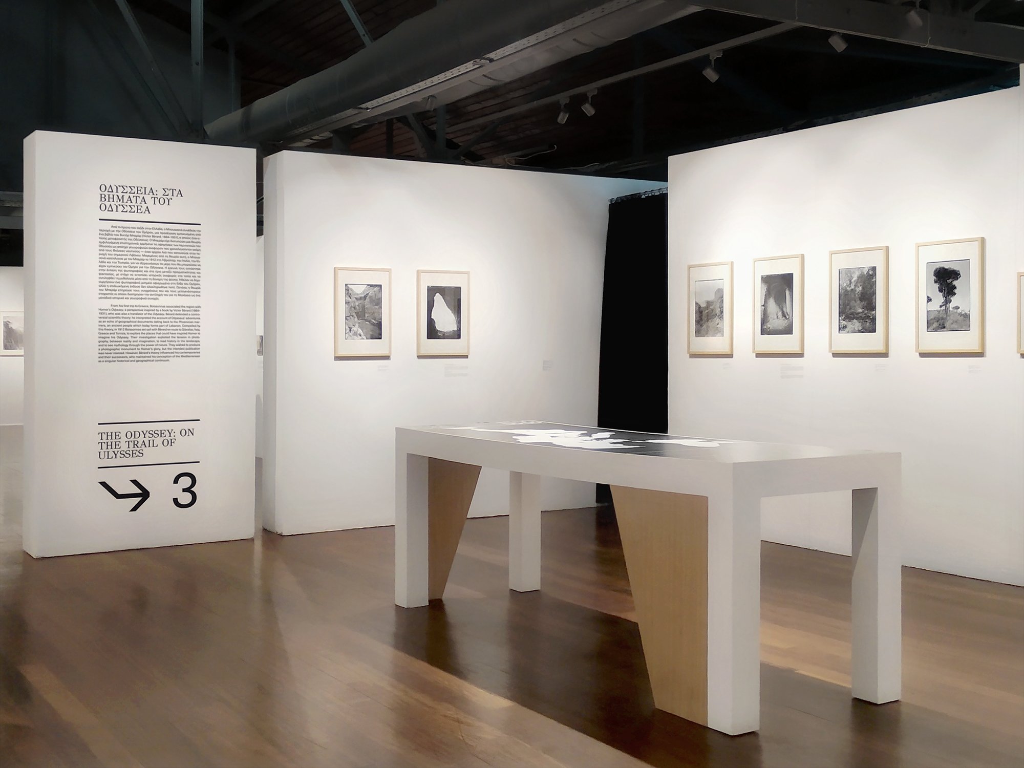
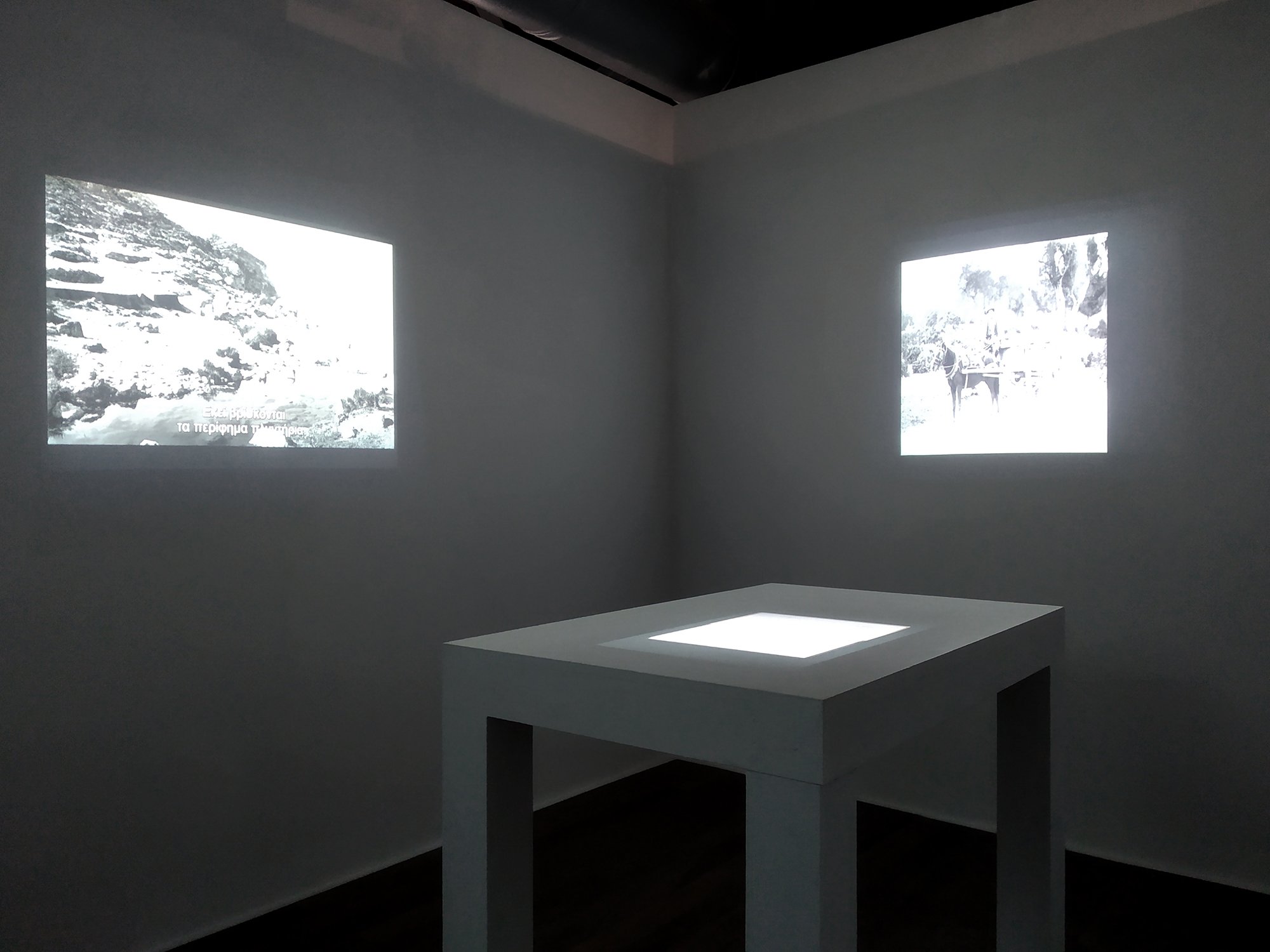
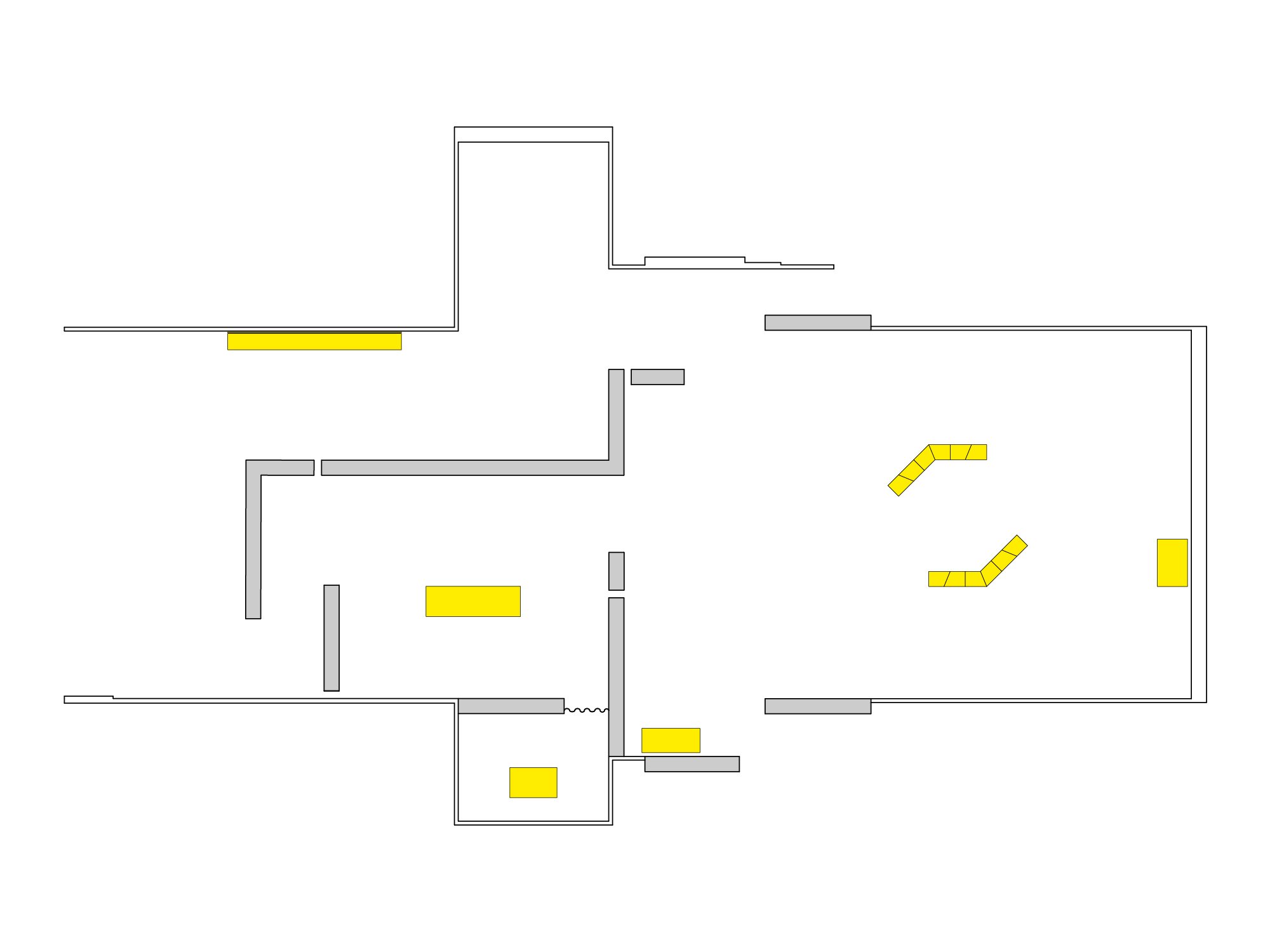
As a result, the architectural language changes progressively in terms of rhythm, spatial scale and forms, reflecting the curatorial narrative and diversity of content in the exhibition space. Furthermore, the concept of encounter was emphasised by accentuating the points of contact between certain structural elements — such as in the cases of designated key-points where the use of small gaps between wall-structures allowed glimpses between spaces, or in details of the custom wooden structures which were designed in a similar manner — but also of movement or the photographer’s dynamic personality through the use of the diagonal. Finally, the spaces were designed with the objective of having a deep depth of field while walking through the exhibition, while the photographs in the main sections were installed closely to each other and aligned to their bottom edges, something that gave the impression of a sea horizon surrounding the visitor.
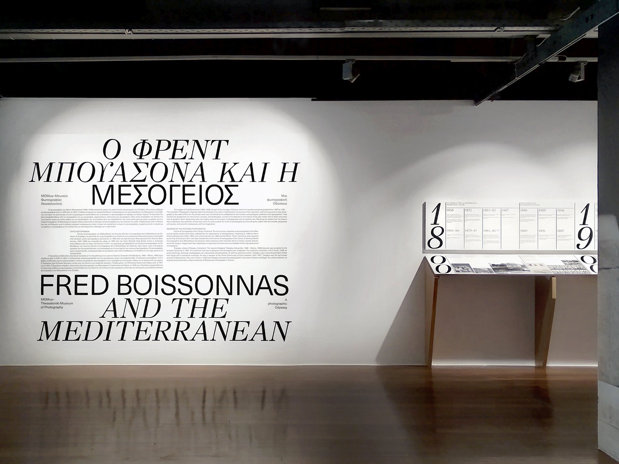
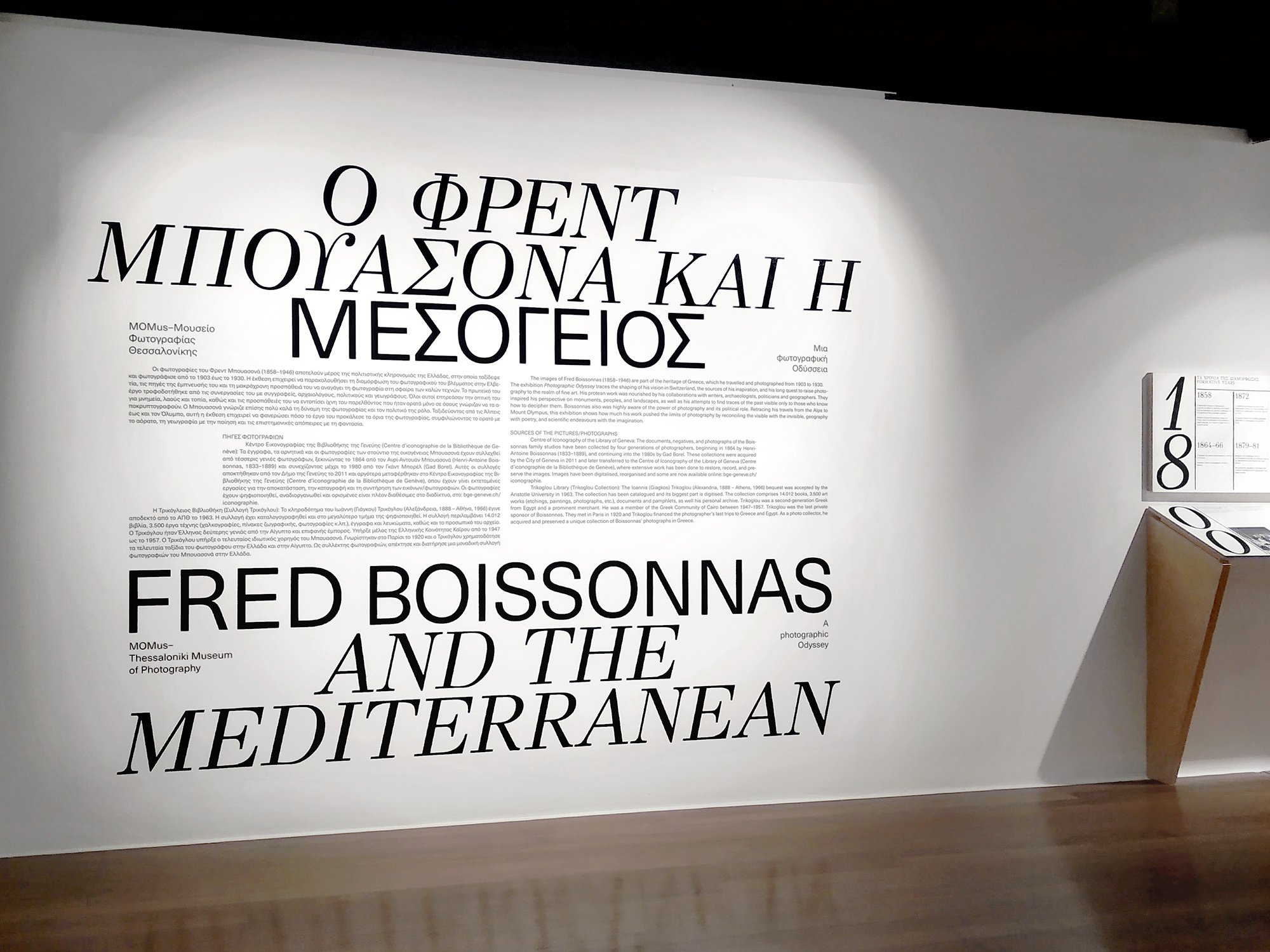
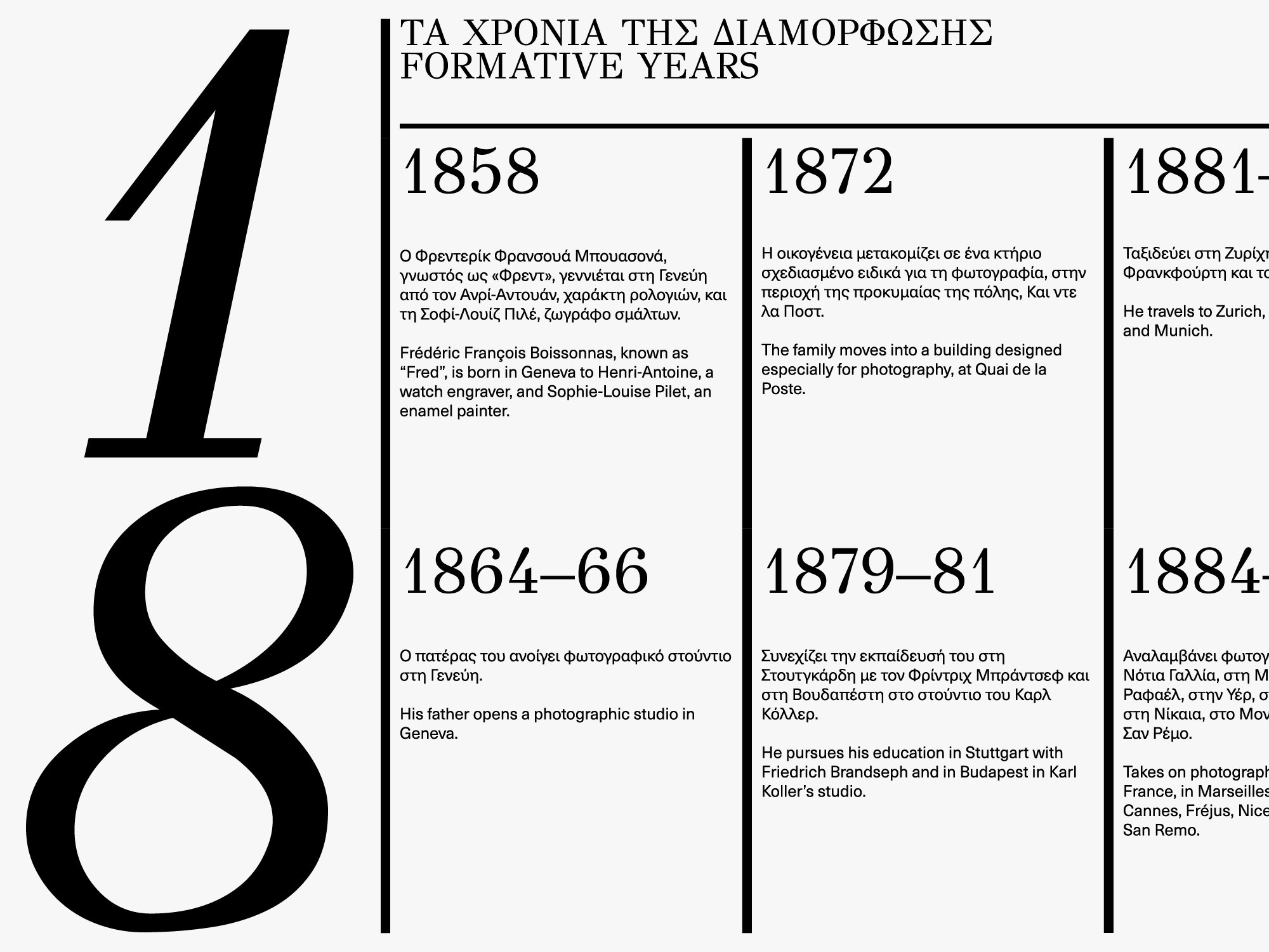
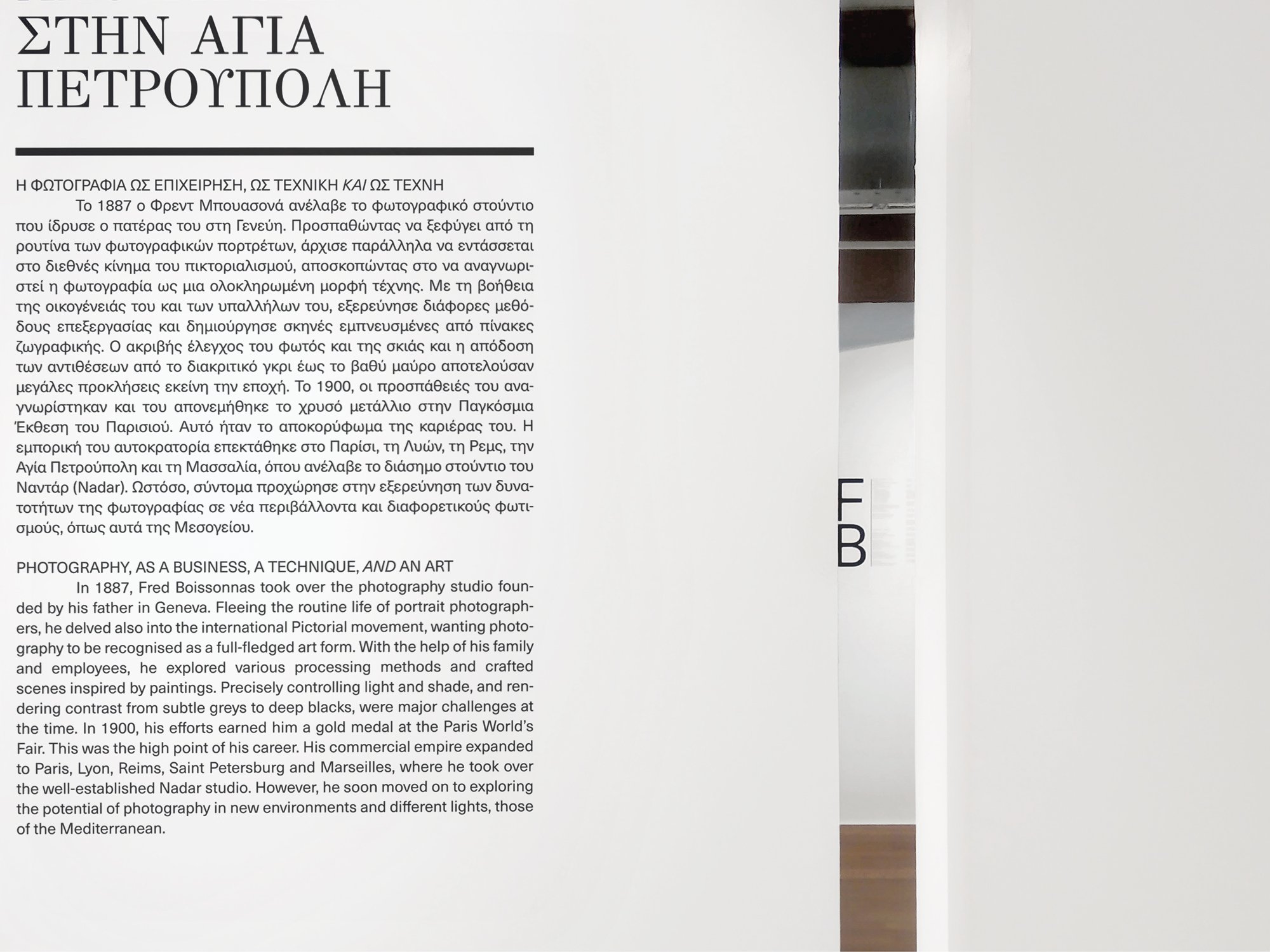
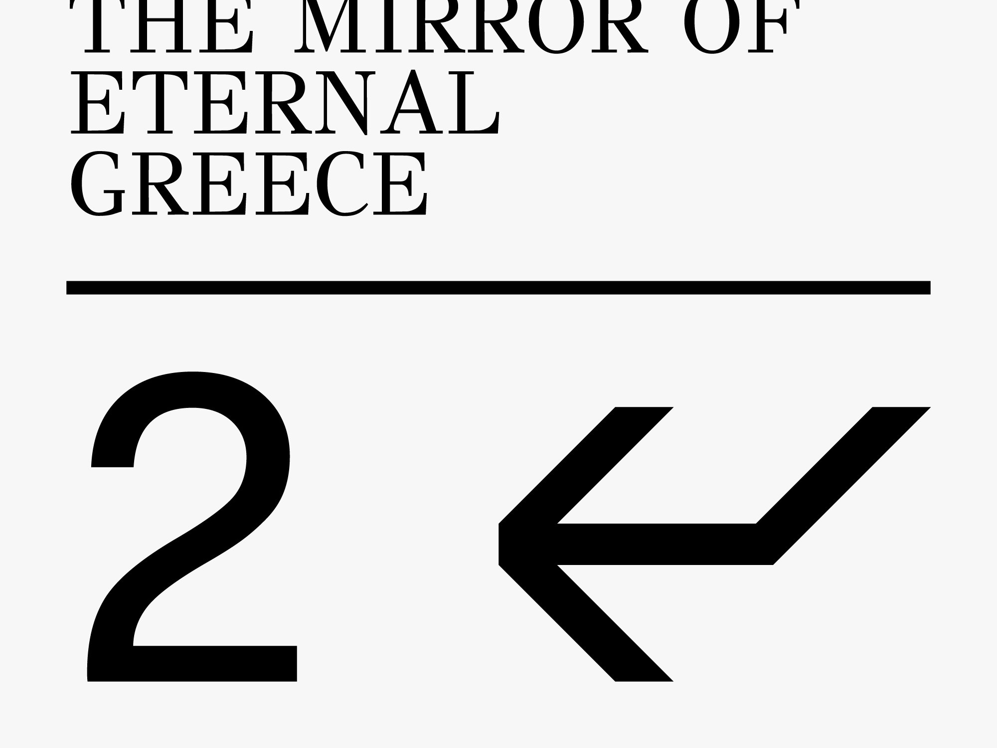
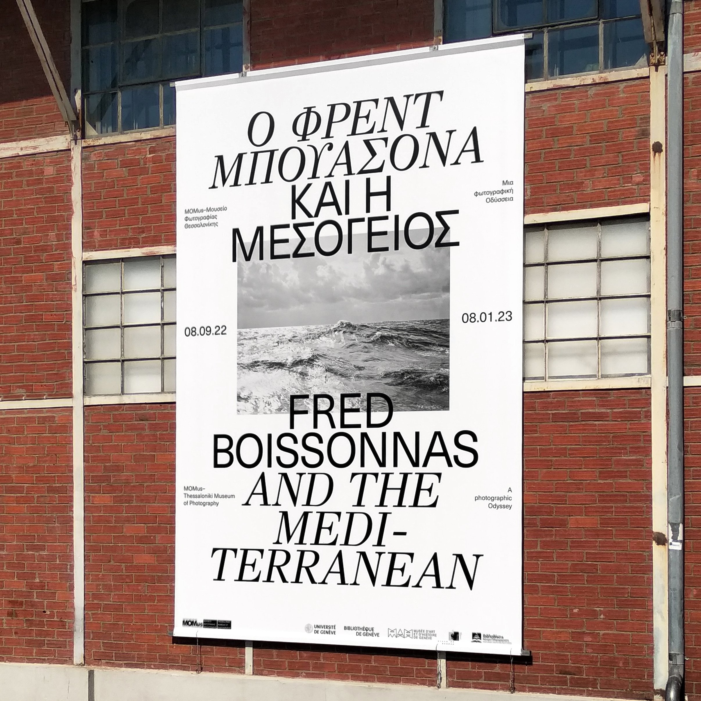
The exhibition’s graphic design applications were approached by relying foremost on the use of typography, through the pairing of GFS Didot (based on the historical typeface designed by the famous French typographer of the same name in 1805) and the modern Neue Haas Unica. Some secondary elements were the absence of any colour whatsoever beyond black-and-white (avoiding any discrepancy between the identity’s colour and the predominately black-and-white photographs), the essentially symmetrical layout with an emphasis on the concept of the horizon, and the use of the diagonal (in applications where italics were used or in the design of the directional arrows). The main goal was to successfully communicate the large amount of information that accompanied the photographer’s work, with absolute respect to his own terms but at the same time placing it in a contemporary context.