In an attempt to visually address an issue as critical but also sensitive as that of Palestine, the primary concern was to approach it directly while maintaining a necessary balance — avoiding, in accordance with the character of the text, both downplaying the situation and any excessive sensationalism. Less design, but more semantically loaded.
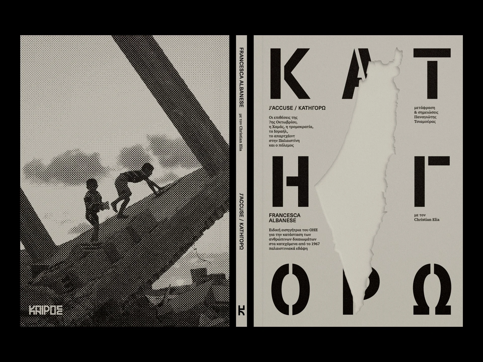
The front cover, in a gray shade inspired by the materiality of the wall separating Israelis and Palestinians, on the one hand features the title set in heavy stencil typography — a direct reference to the spray-painted warning signs seen in Palestinian territories under Israeli occupation. On the other, however, the composition is interrupted by the debossed shape of Palestine, partially obscuring the title while evoking a slit or wound on the surface of the paper. The back cover, overlaid with a halftone photograph of ruins in Gaza, adds a further sense of directness and rawness. The cover’s design concept continues organically into the body of the book, with the first 16-page signature printed in a deep crimson colour.
Lastly, the main layout design is based on the idea of gradually expanding the inner margin (gutter) from chapter to chapter — thus gradually reducing the text width and as such incorporating into the reading process itself the notions of forced displacement and expansionism (further emphasised by the vertical lines), widening the edition’s scope into something more than purely practical textbook.