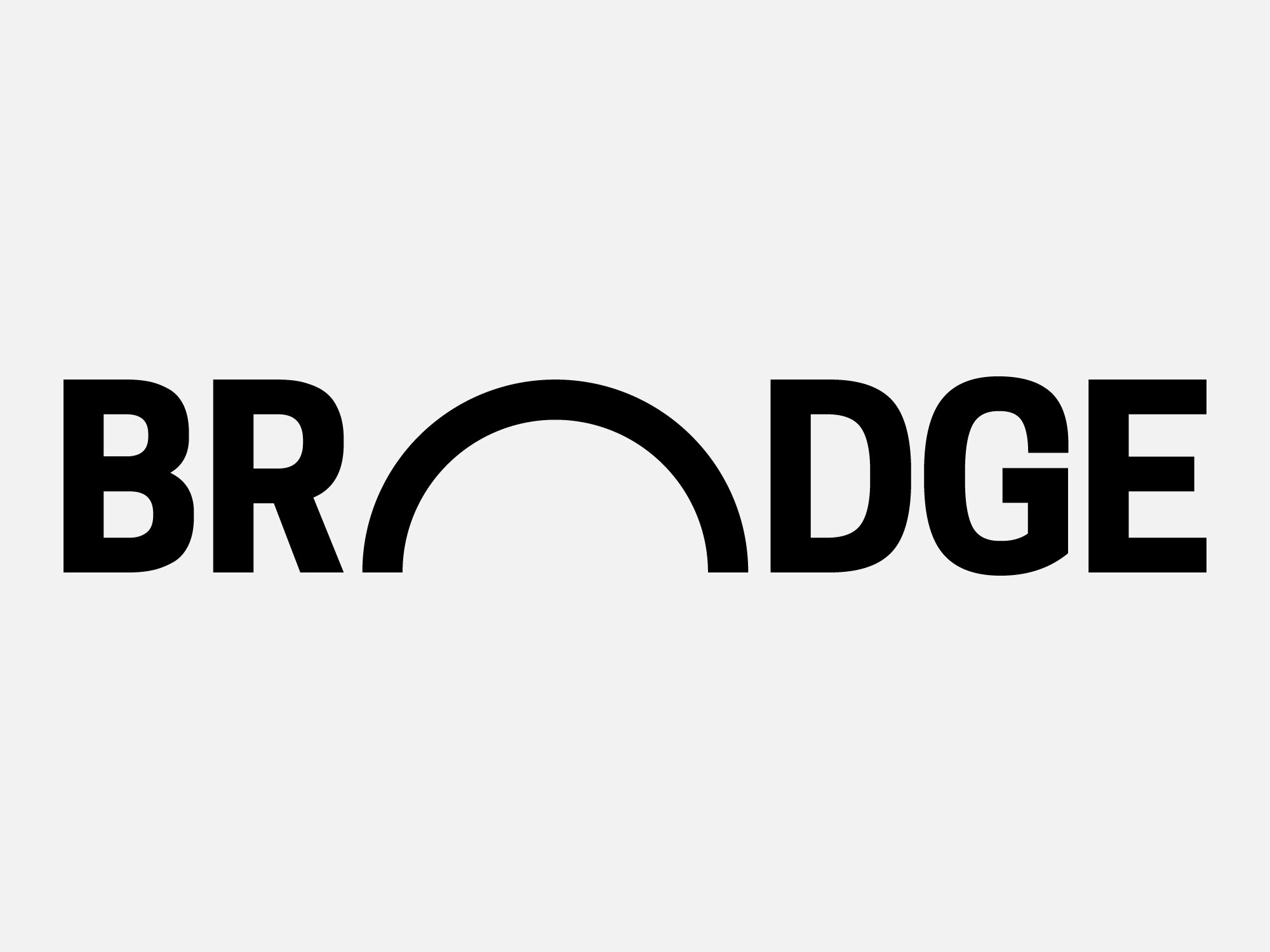
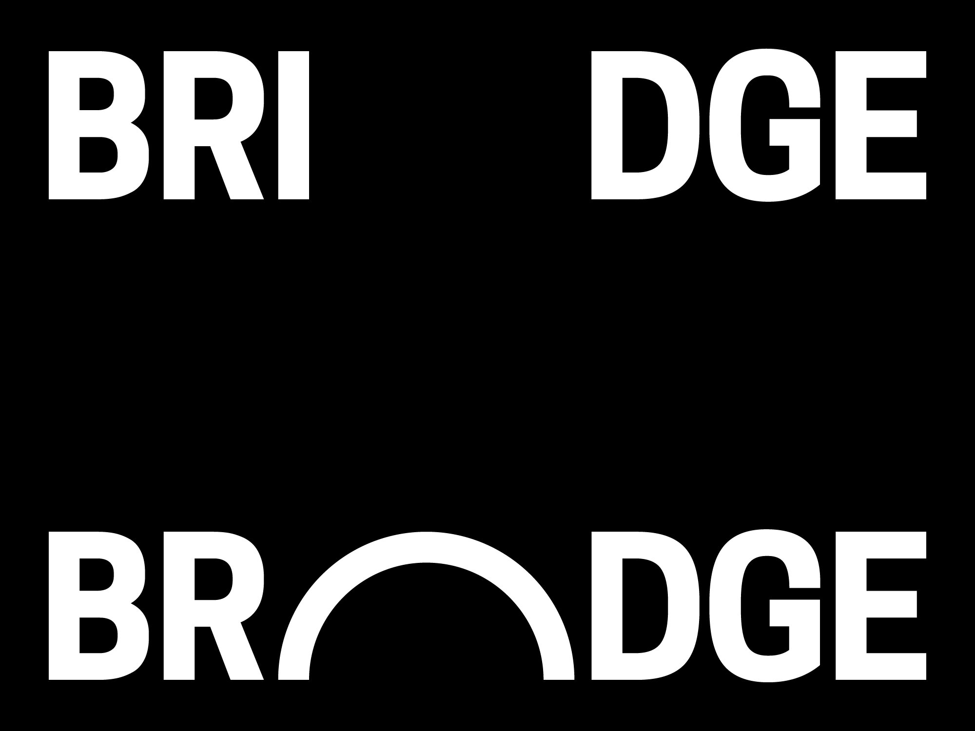
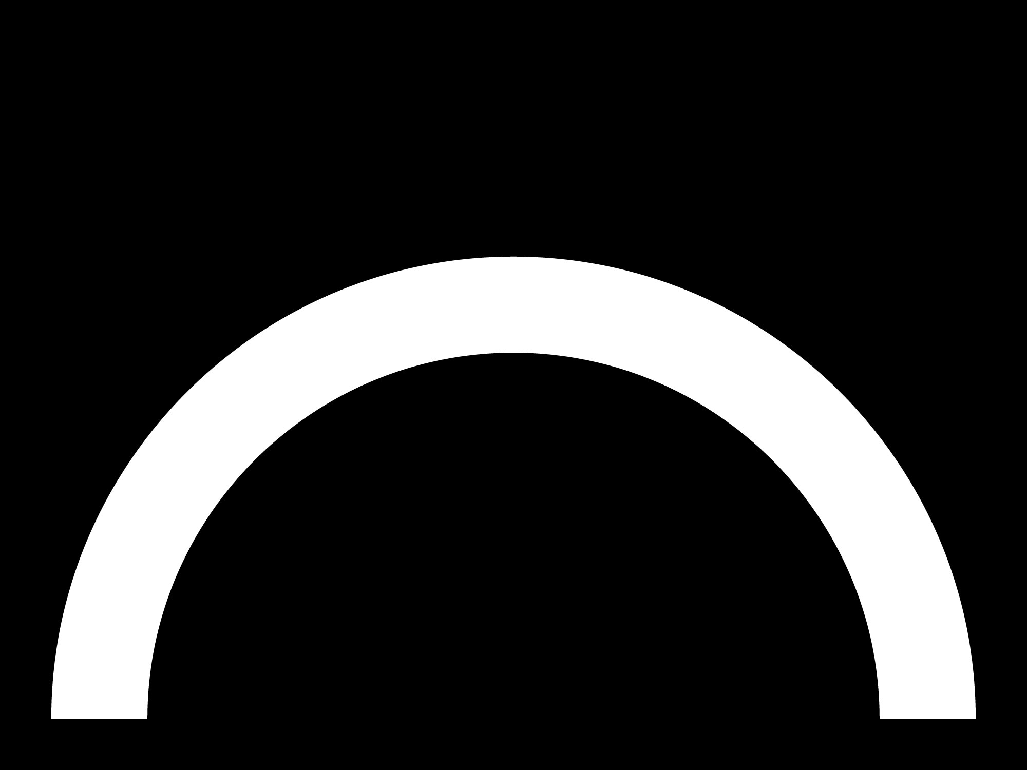
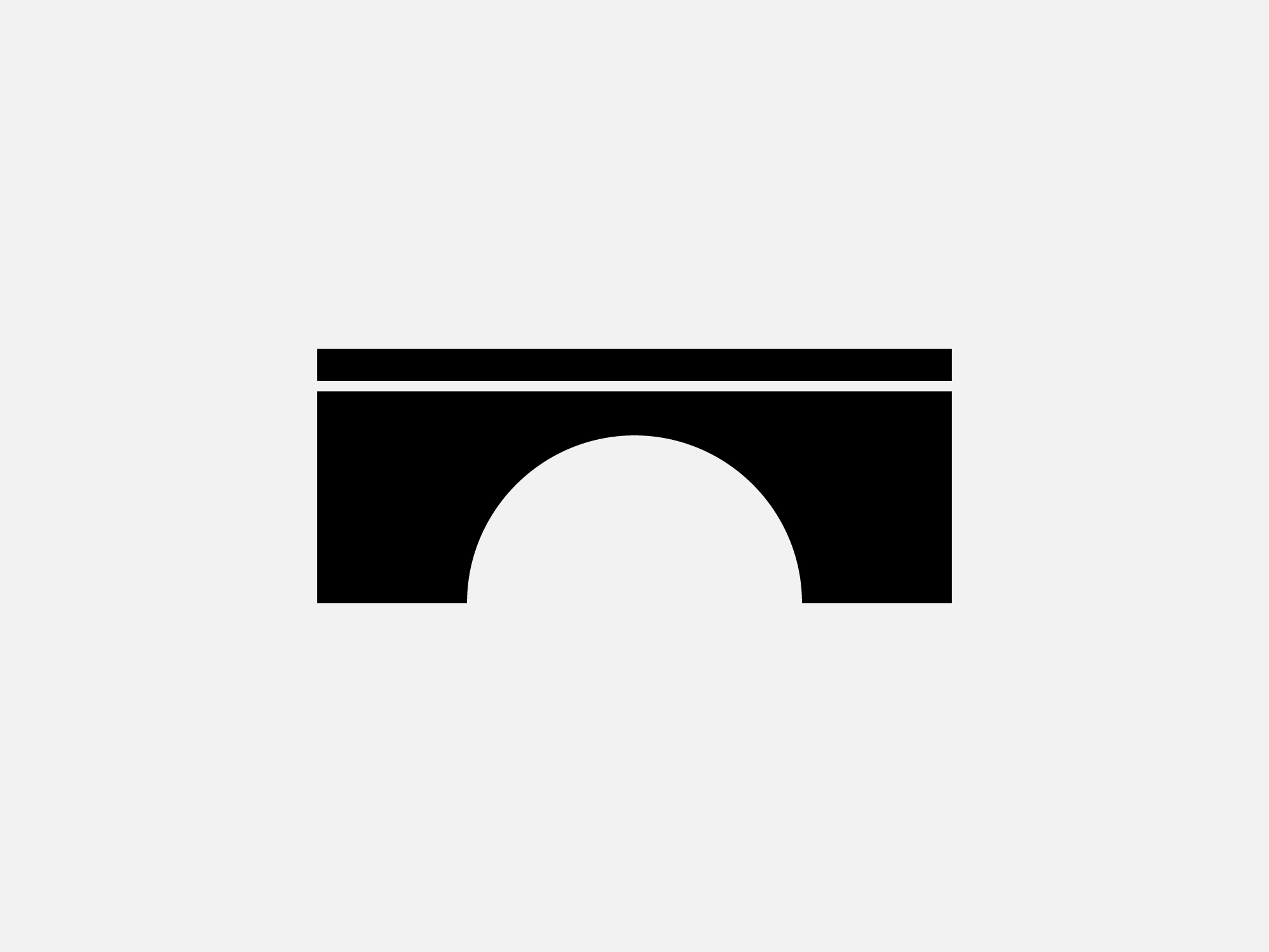
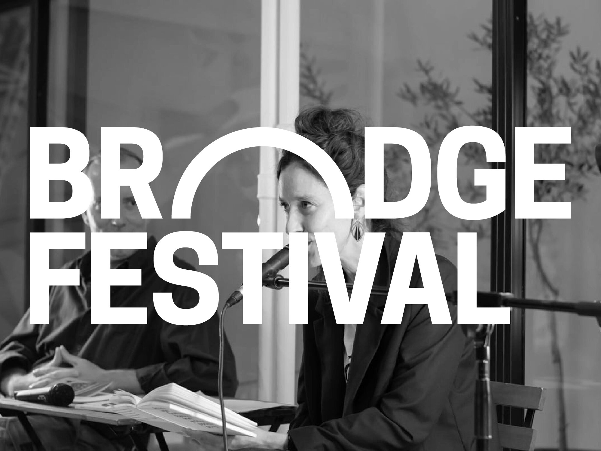
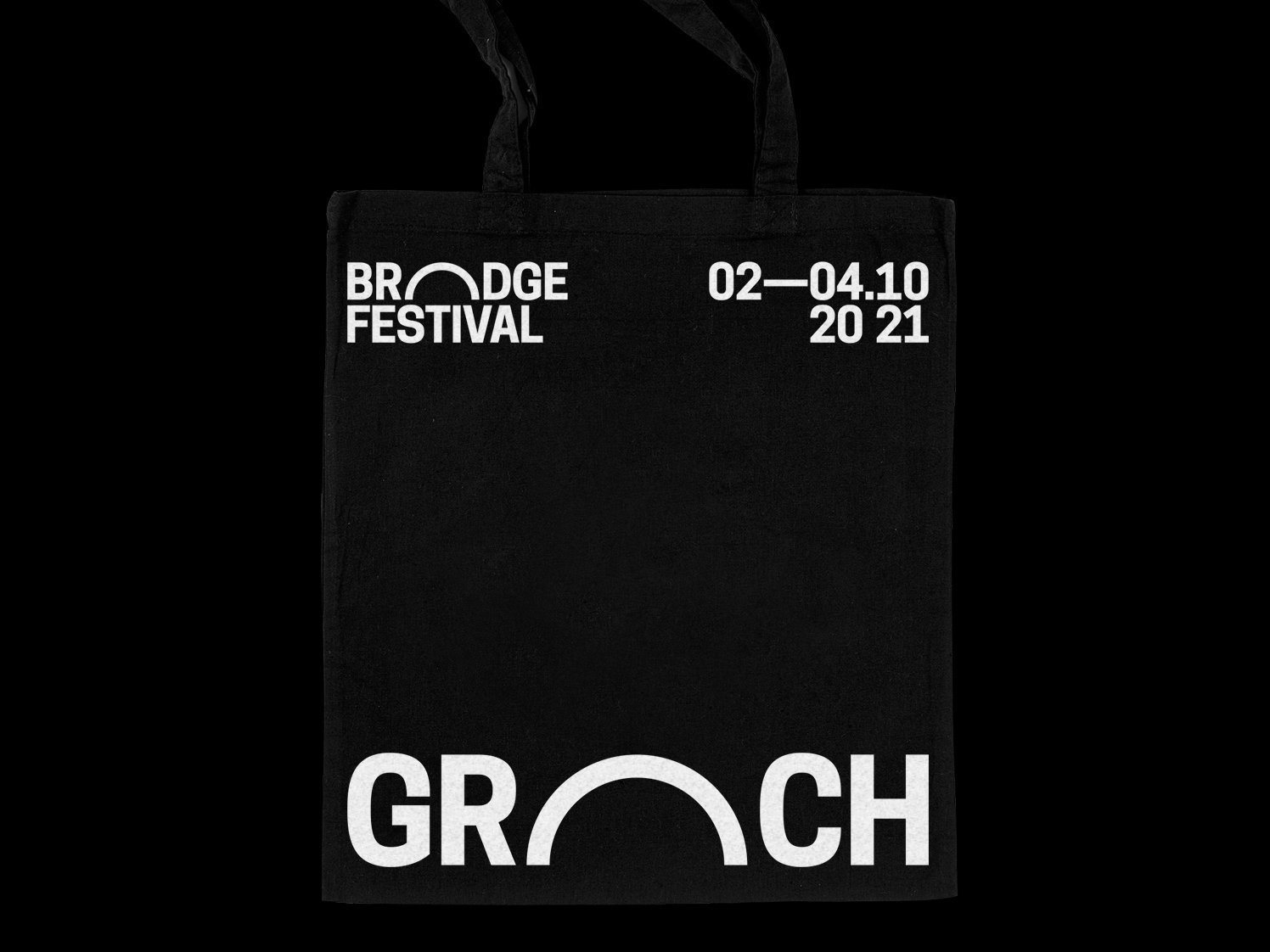
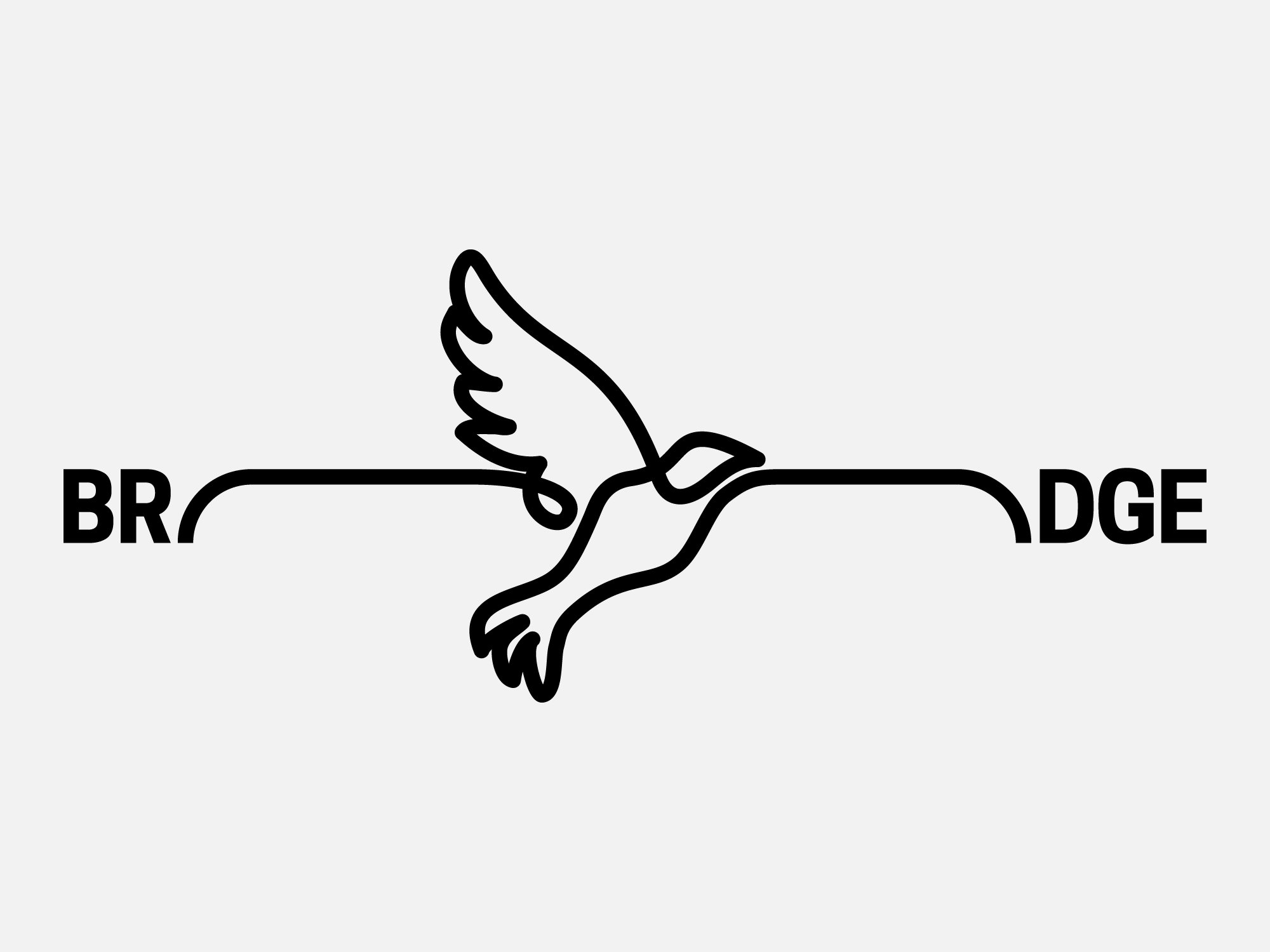
For its visual identity we focused on its already image-centred name, and the simple, albeit direct, way in which language is used to communicate the initiative’s primary objective and overall philosophy. In order to maintain this focus on the written word while amplifying its meaning’s visual impact, we chose to extend the letter ‘I’ so as to form an arch that ‘connects’ the first two with the last three letters — symbolising the concept of the bridge (emphasising the ideas of connecting, reaching out, and being on the move), as well as the characteristic curve of the book’s page. This arch-form can also function autonomously as the identity’s symbol, while as a graphic system it constitutes a flexible base for unlimited creative possibilities in the future.