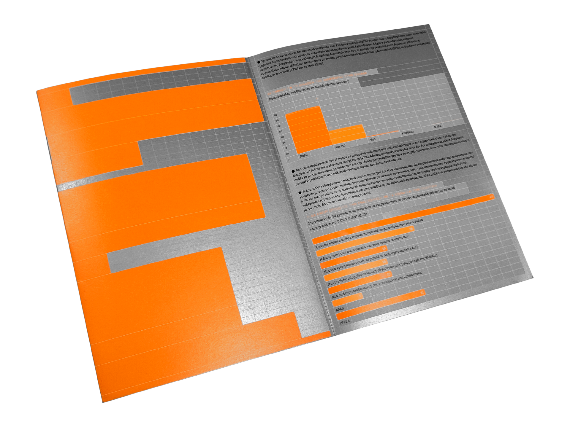
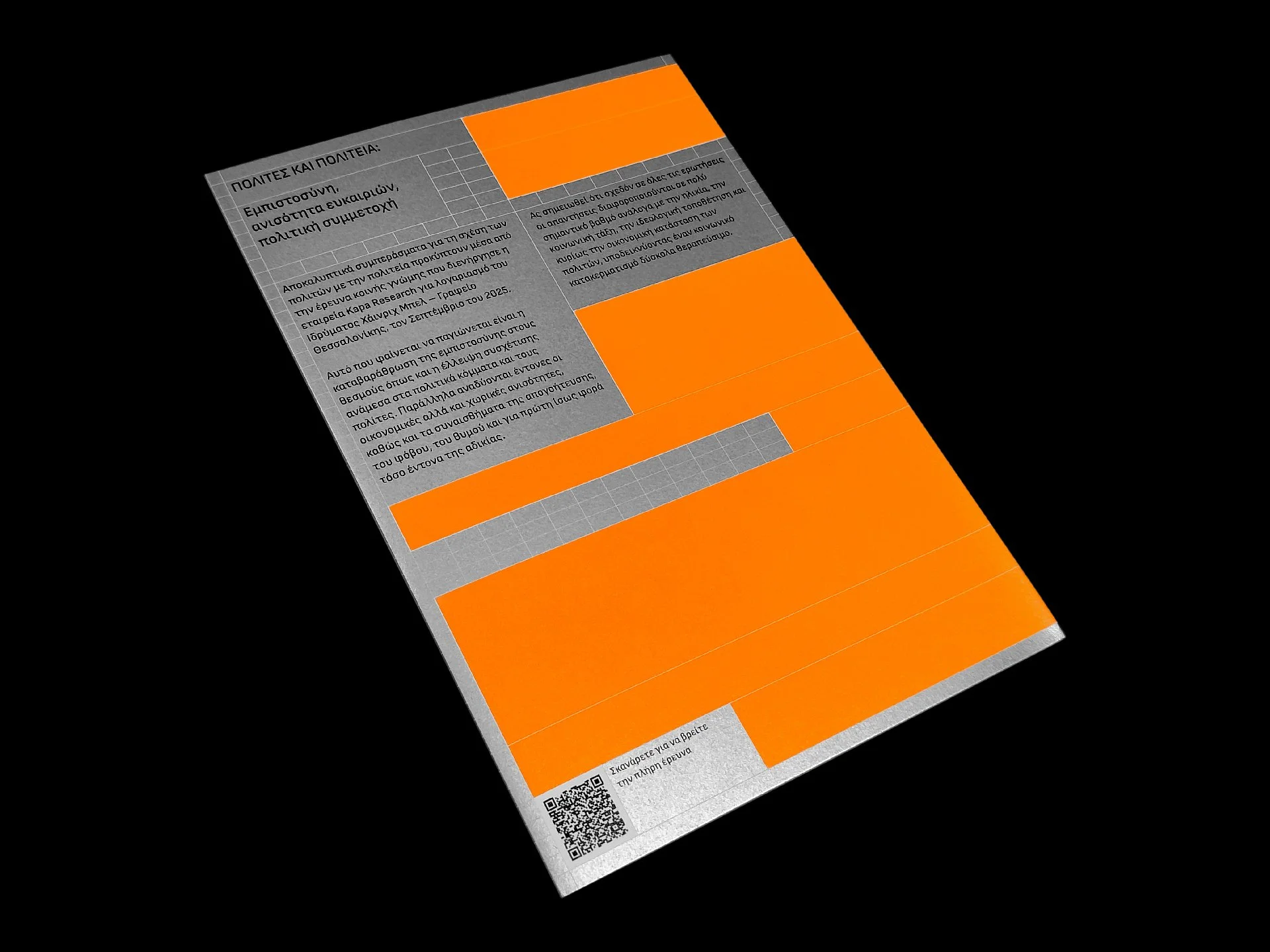
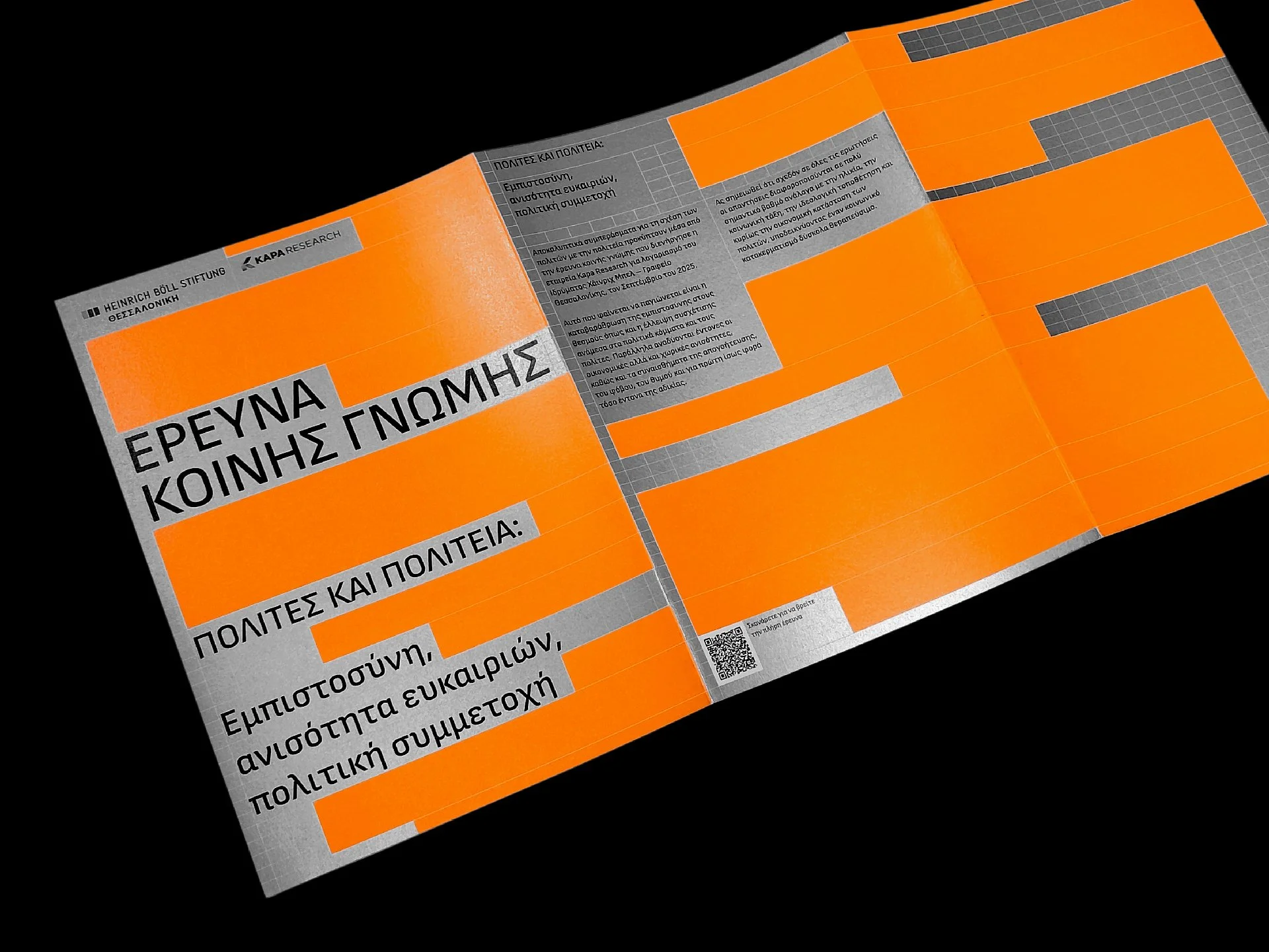
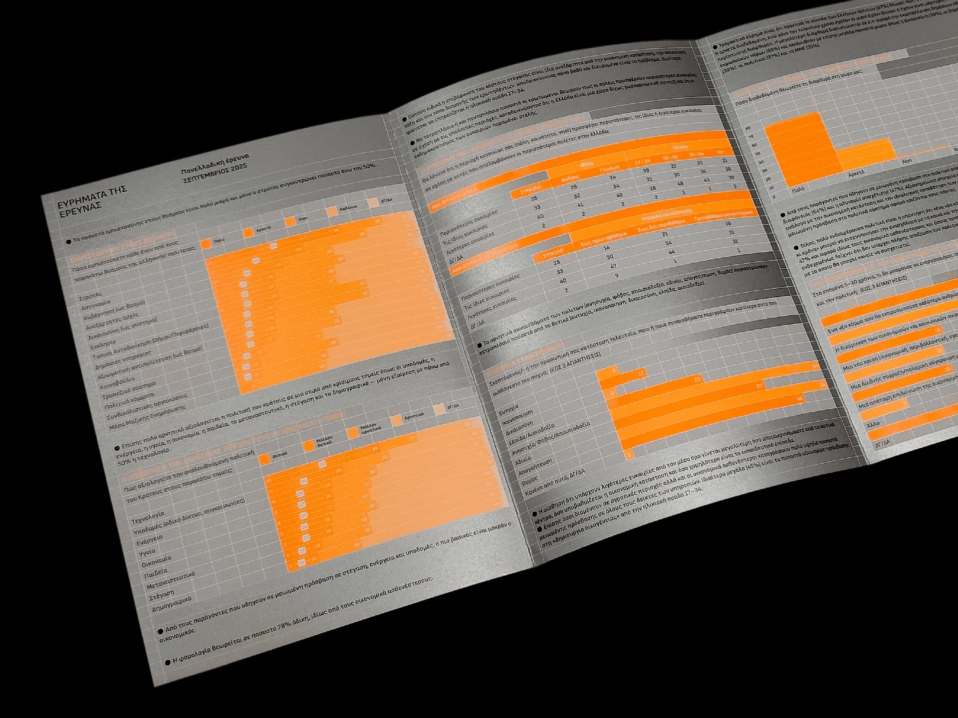
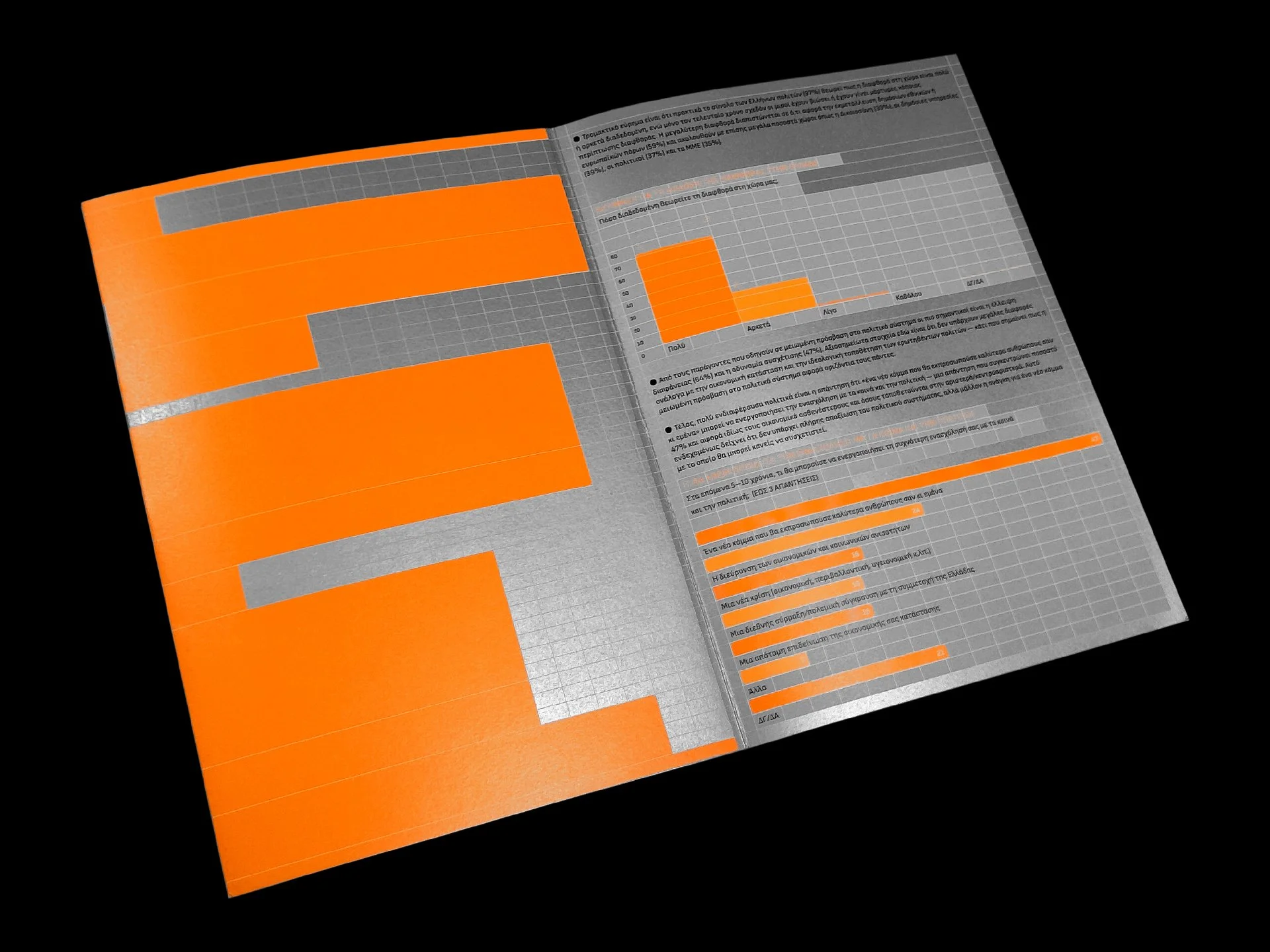
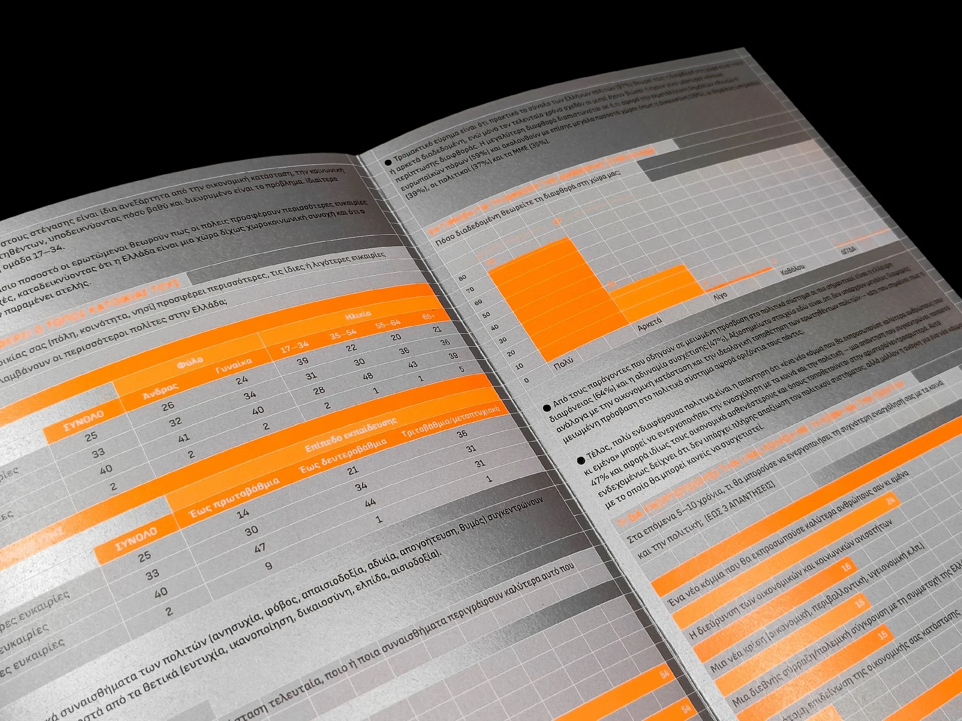
The Foundation’s aim was to present a selection of the above research results in the form of a printed brochure, with the goal of informing the public and raising awareness of the findings’ criticality. Its design was based on a modular system of Excel-type cells inspired by the graphic language of the main content — namely, the graphs themselves — which is not confined to them alone but instead shapes the entire brochure, leading to a unified, dynamic composition. The colours chosen — neon orange, silver, and black — along with the dynamic use of typography, lend a bold, attention-grabbing character that corresponds to the critical nature of the research results.