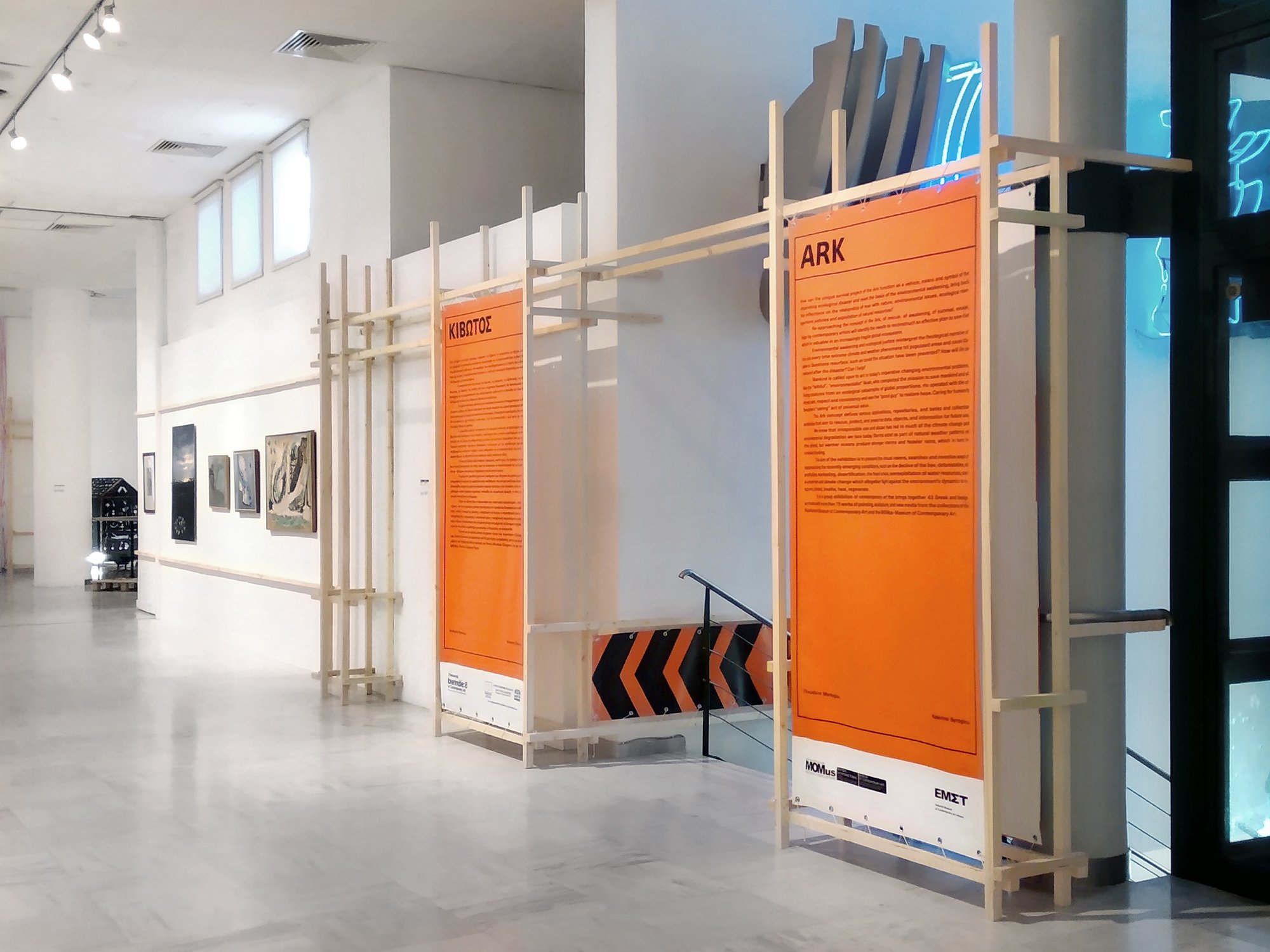
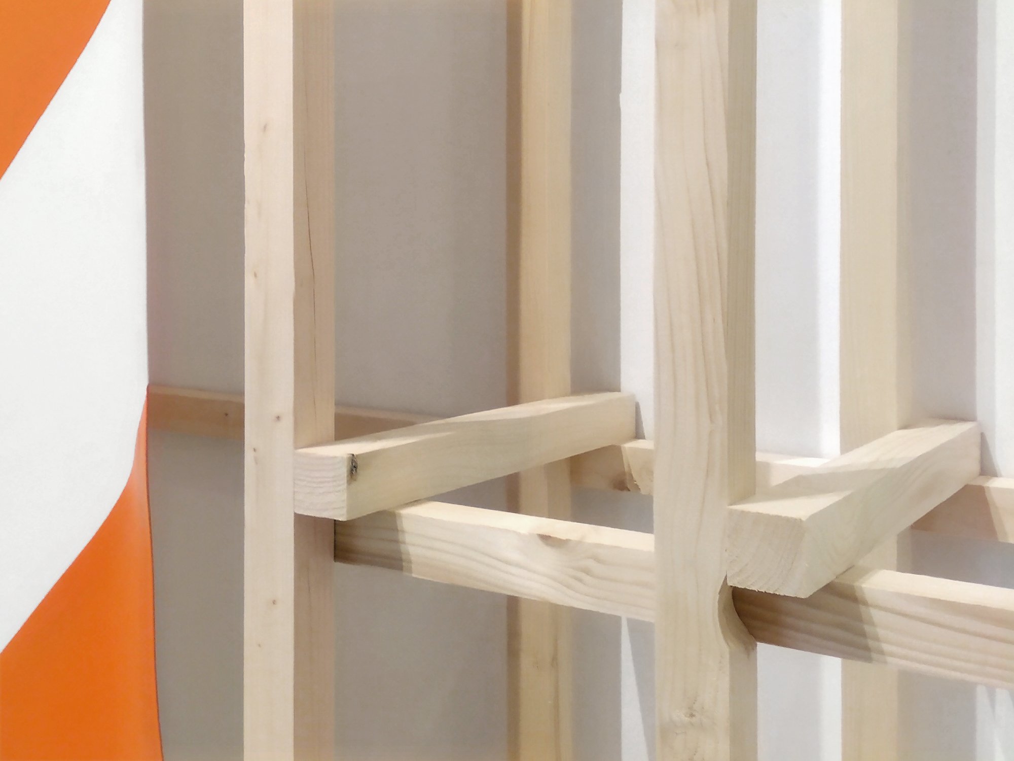
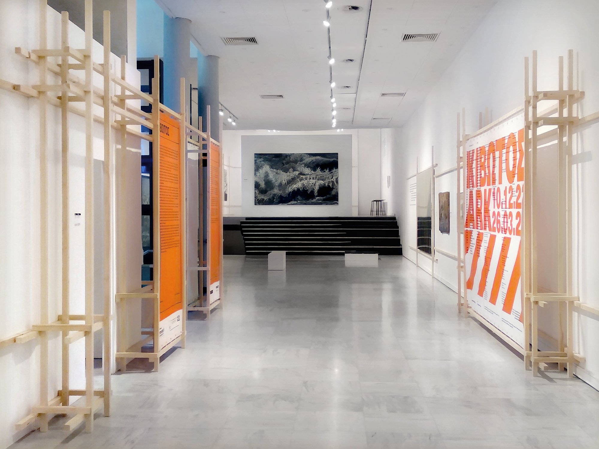
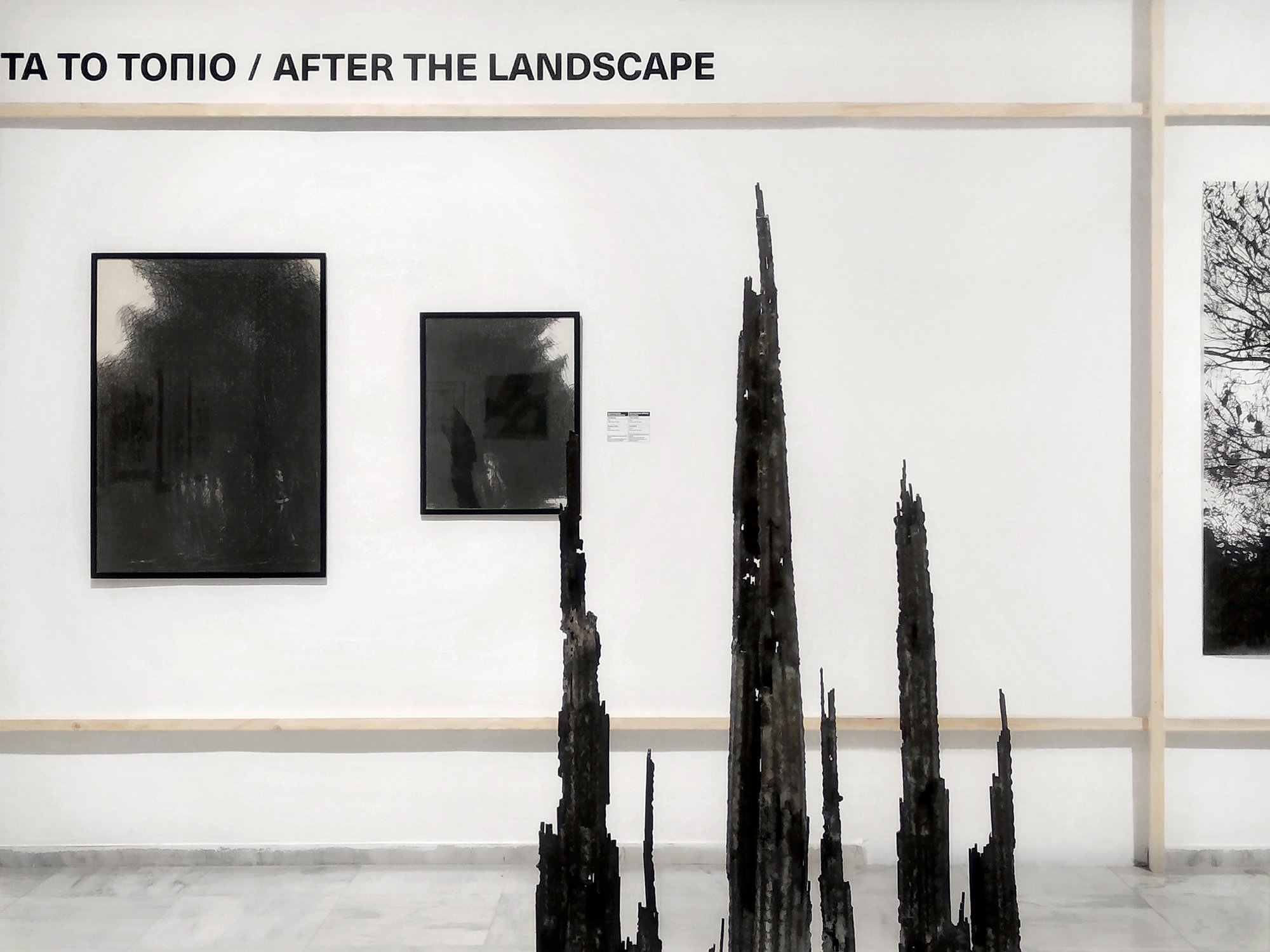
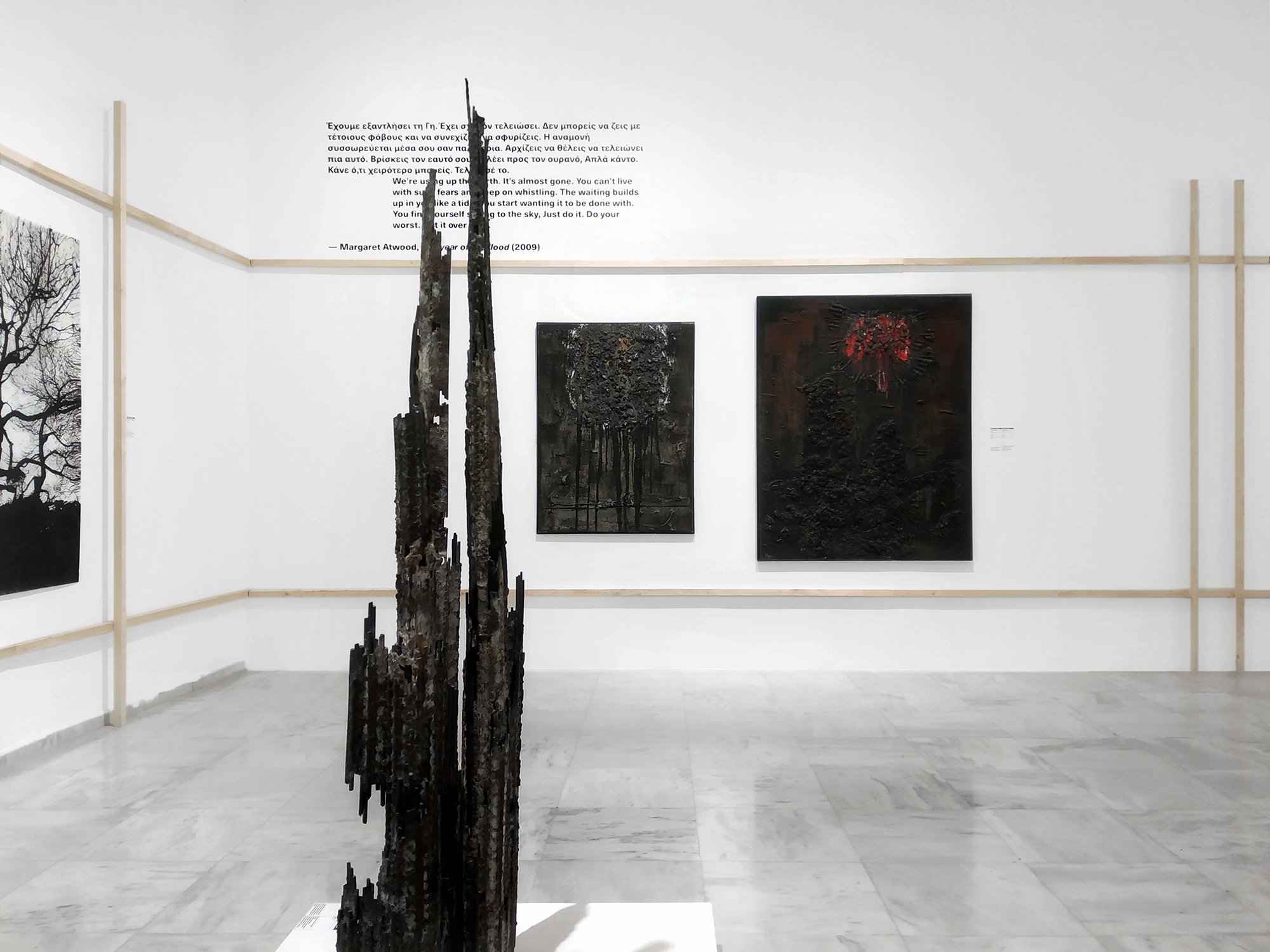
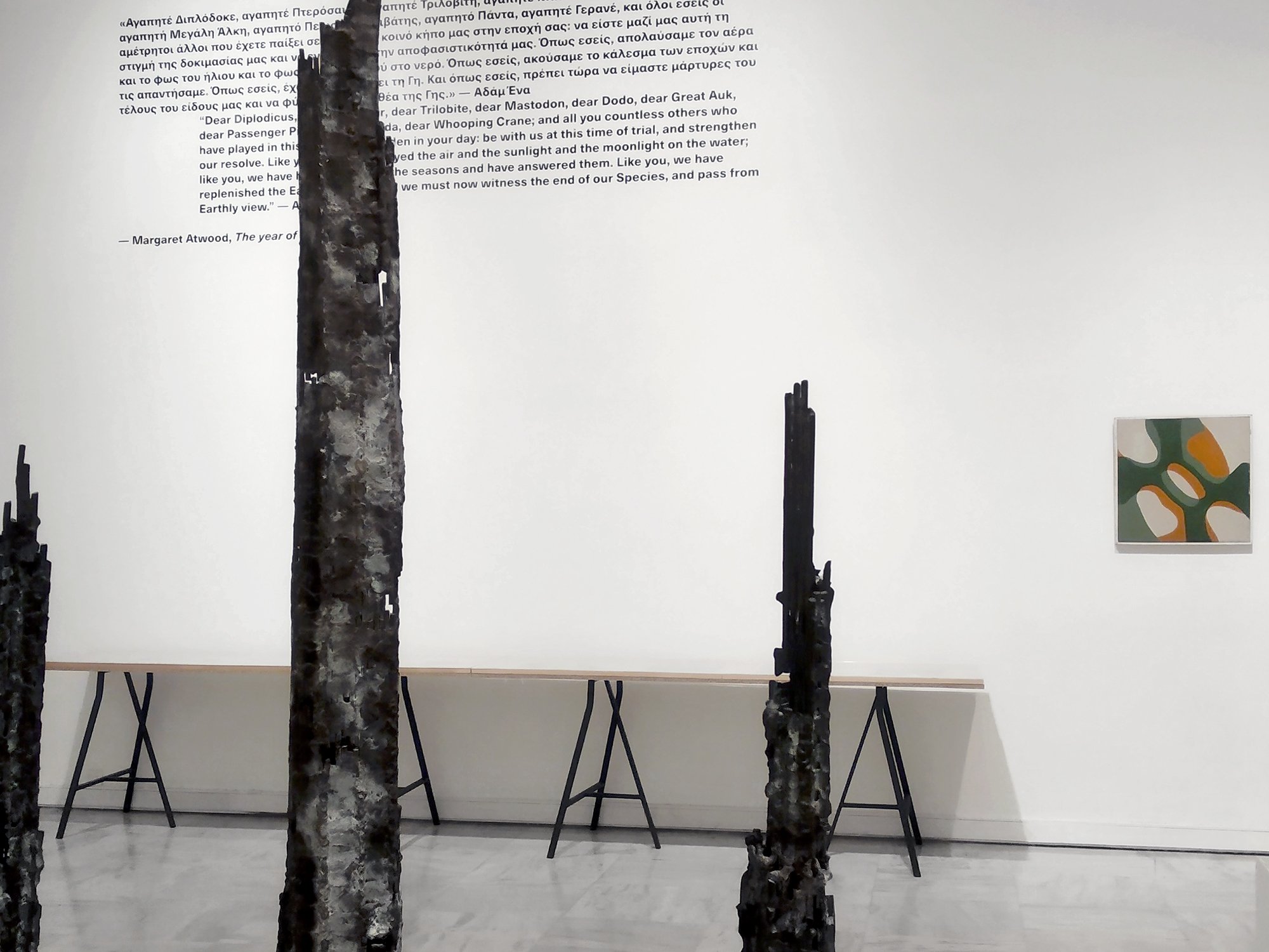
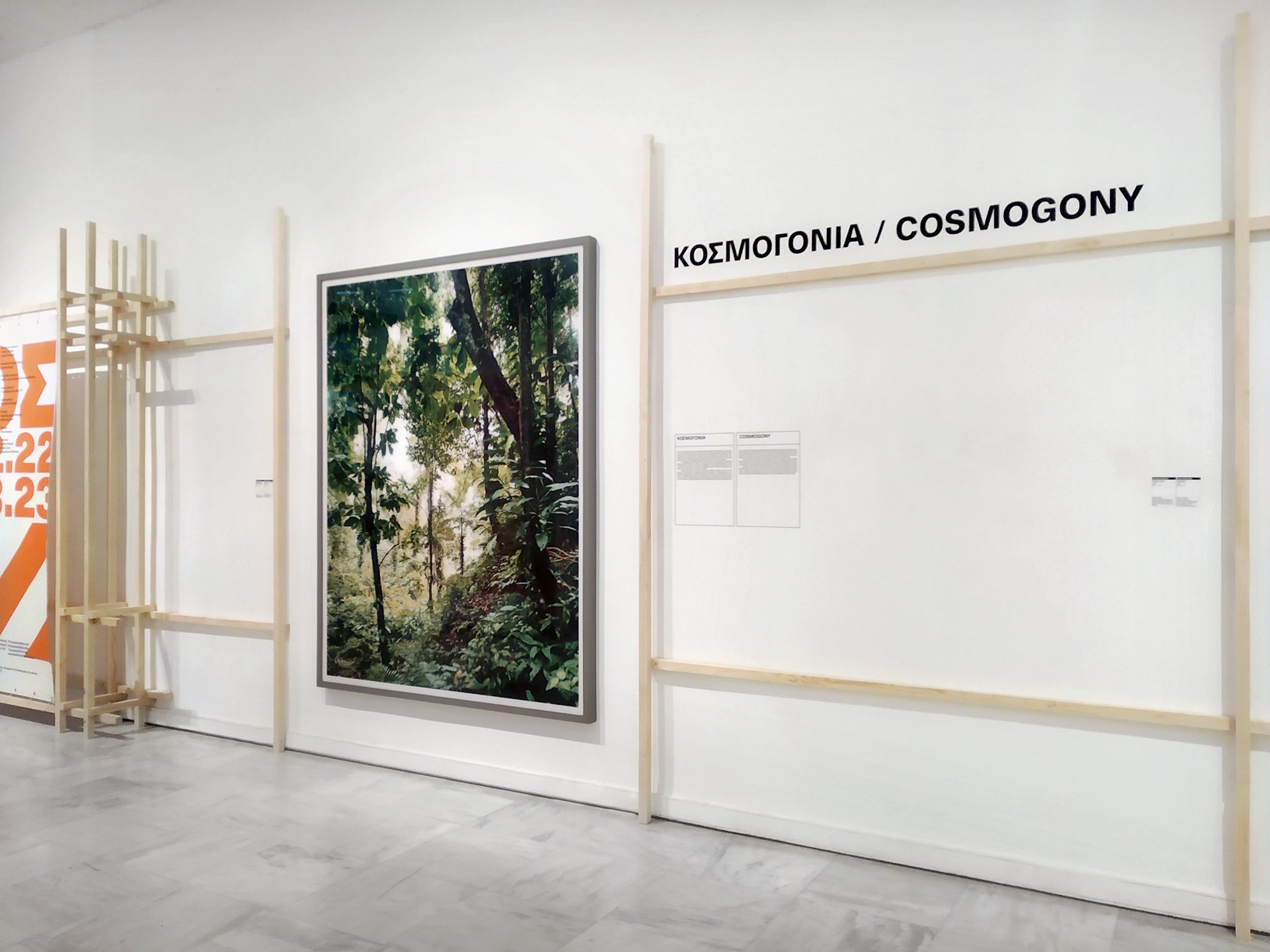
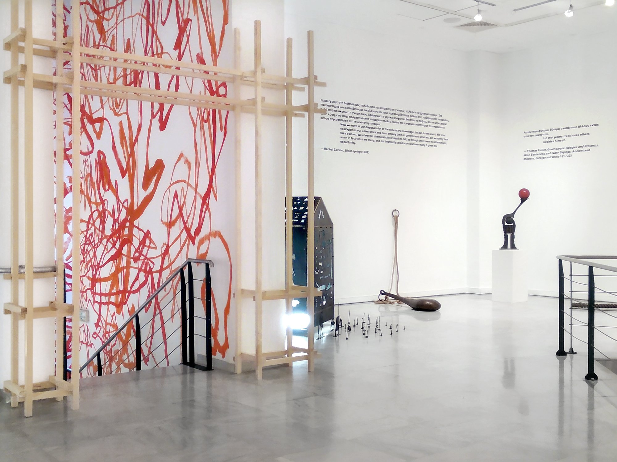
Contrary to the linearity of its starting point, the exhibition doesn’t entail a predetermined course but has multiple entry points which allow for multiple ways of walking through it. The above parallel between the Ark and the museum was visualised in the space by turning it into somewhat of a ship in the stage of construction, introducing relationships such as content-shell, safety-danger etc. The architectural language’s key element is a structural system reminiscent of scaffolding, consisting of vertical and horizontal wooden beams in varying density, providing a visual rhythm that interacts with that of the artworks. This system largely spread out on top of the museum’s walls, following the existing architecture and merging with the artworks, while at the same time forming more complex constructions at certain points of the exhibition such as the entrances.
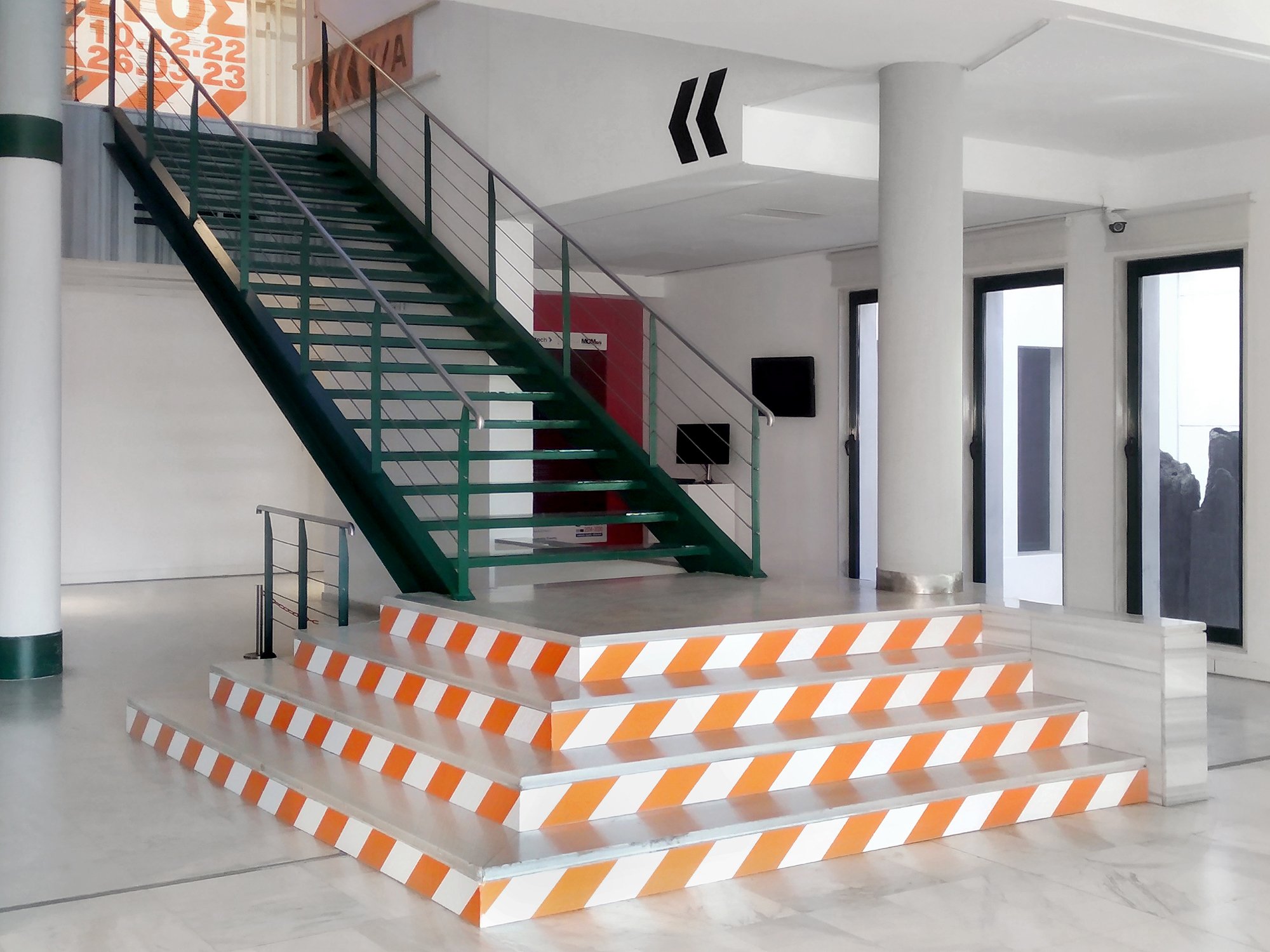
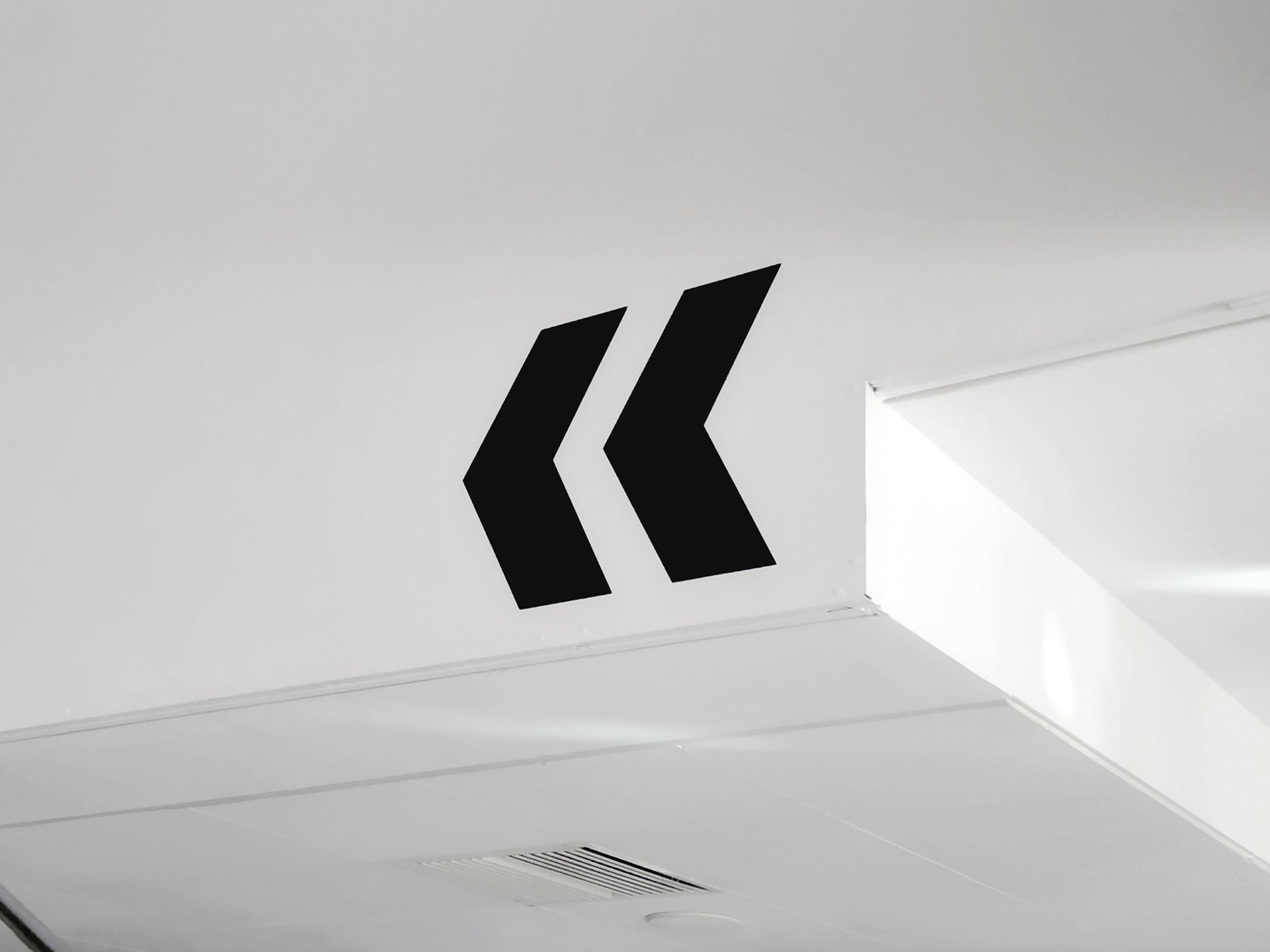
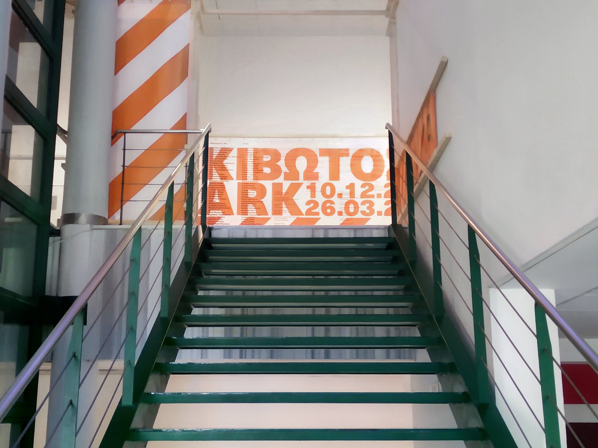
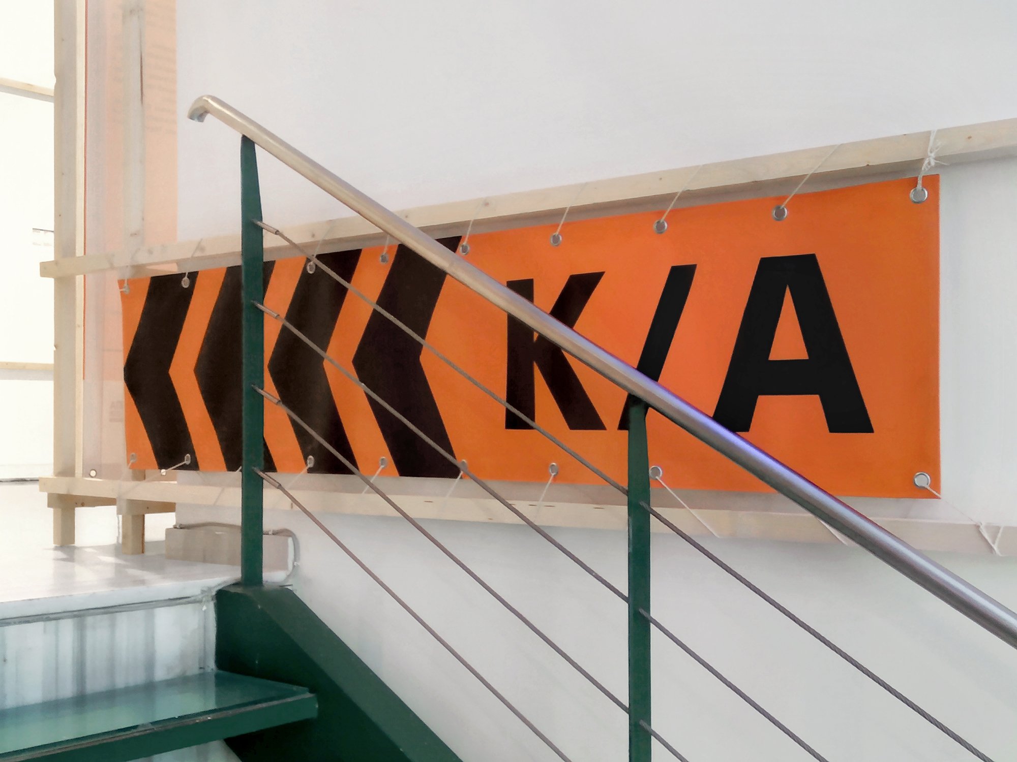
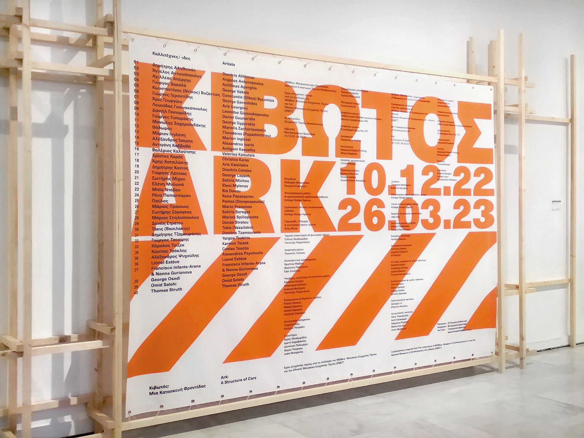
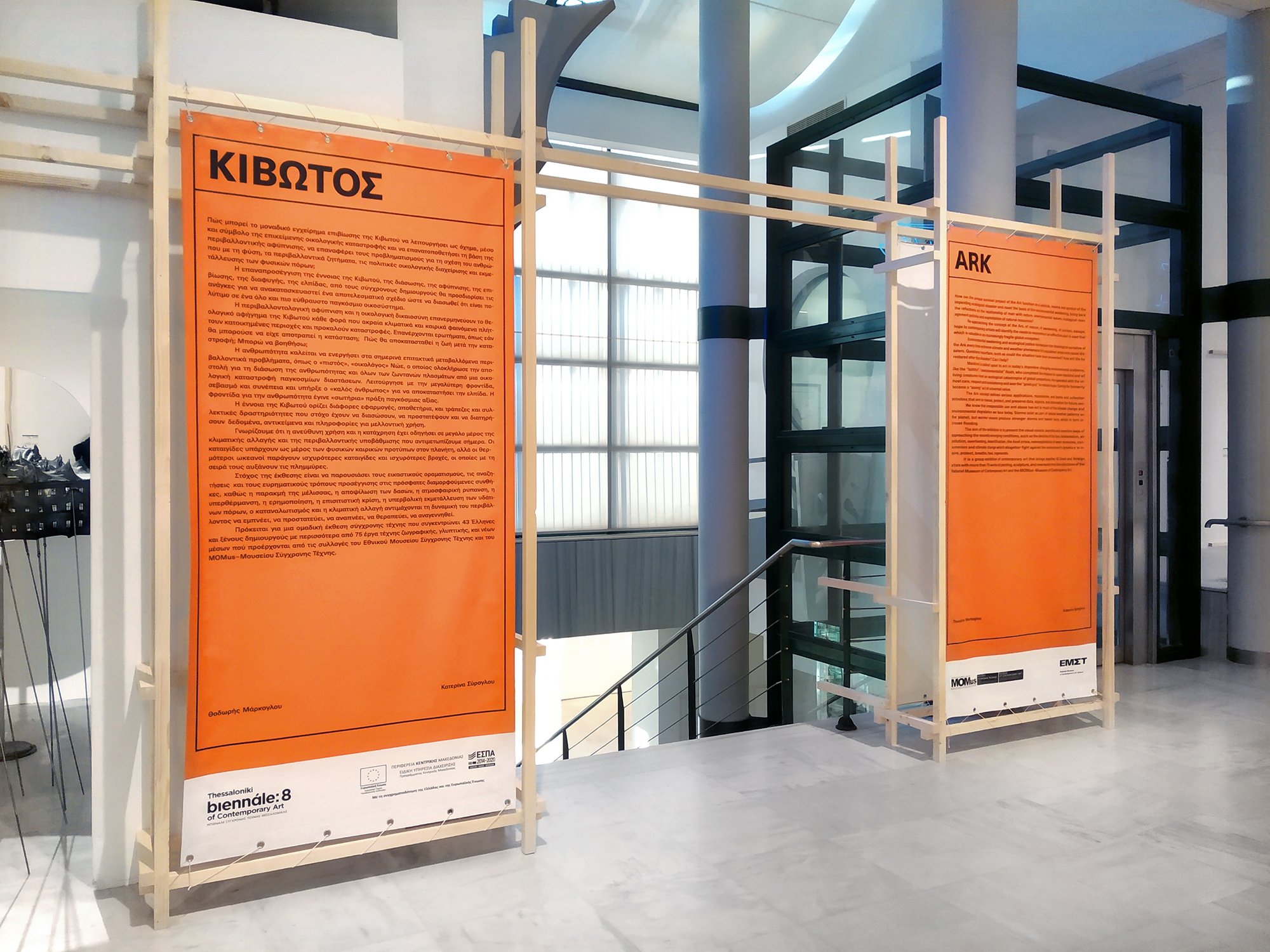
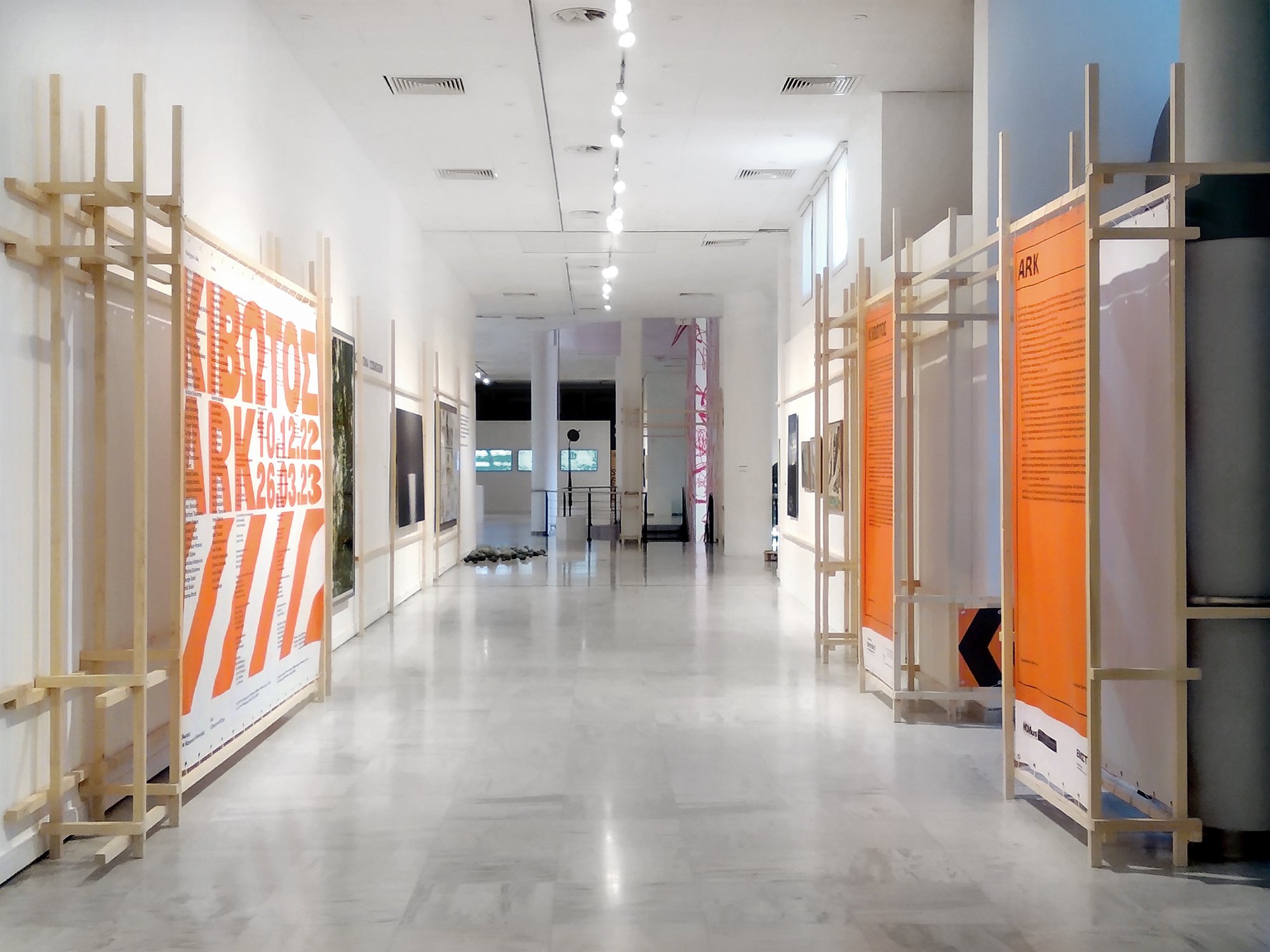
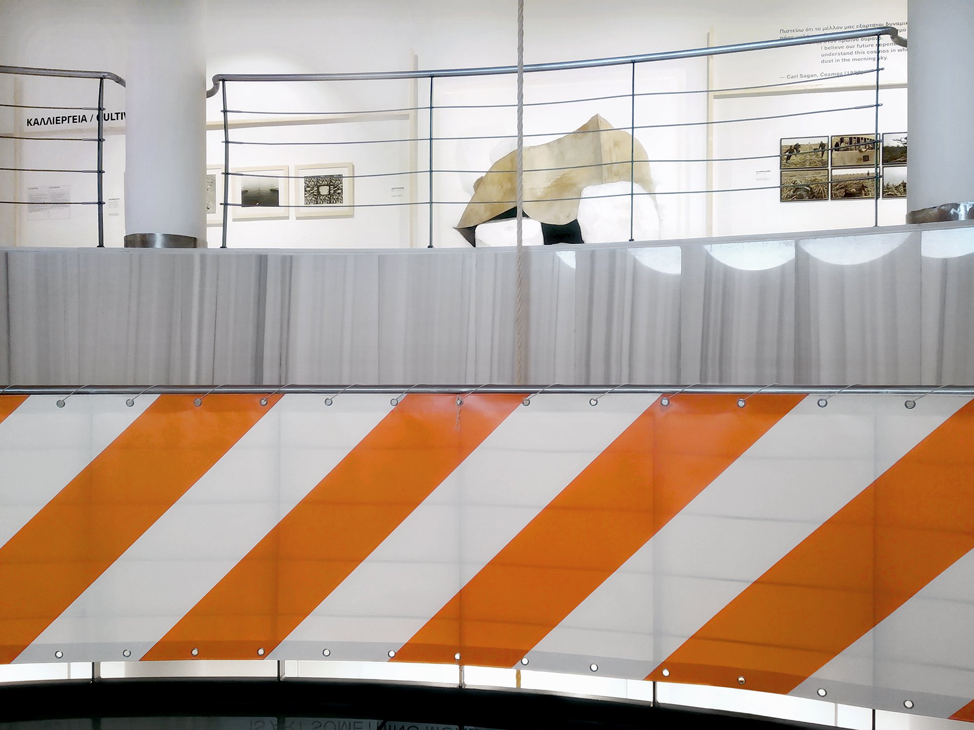
The exhibition identity’s graphic language, used frequently throughout the space, is largely based on elements from the leading system of signals and warnings, as determined in accordance to stipulations from the International Organization for Standardisation (ISO) and separate national organisations such as the American National Standards Institute (ANSI). Ιn pursuit of a correspondingly high-contrast colour palette, the chosen primary colour is the vivid Safety Orange (as standardised in ANSI Z535.1) complemented by black and white, which in combination with heavy typography used in extremely contrasting sizes, and an amplified sense of materiality (as shown through the choice of hanging banners), adds up to a narrative-driven ambiguous total that balances a hard, industrial aesthetic with a sense of warmness and safety.