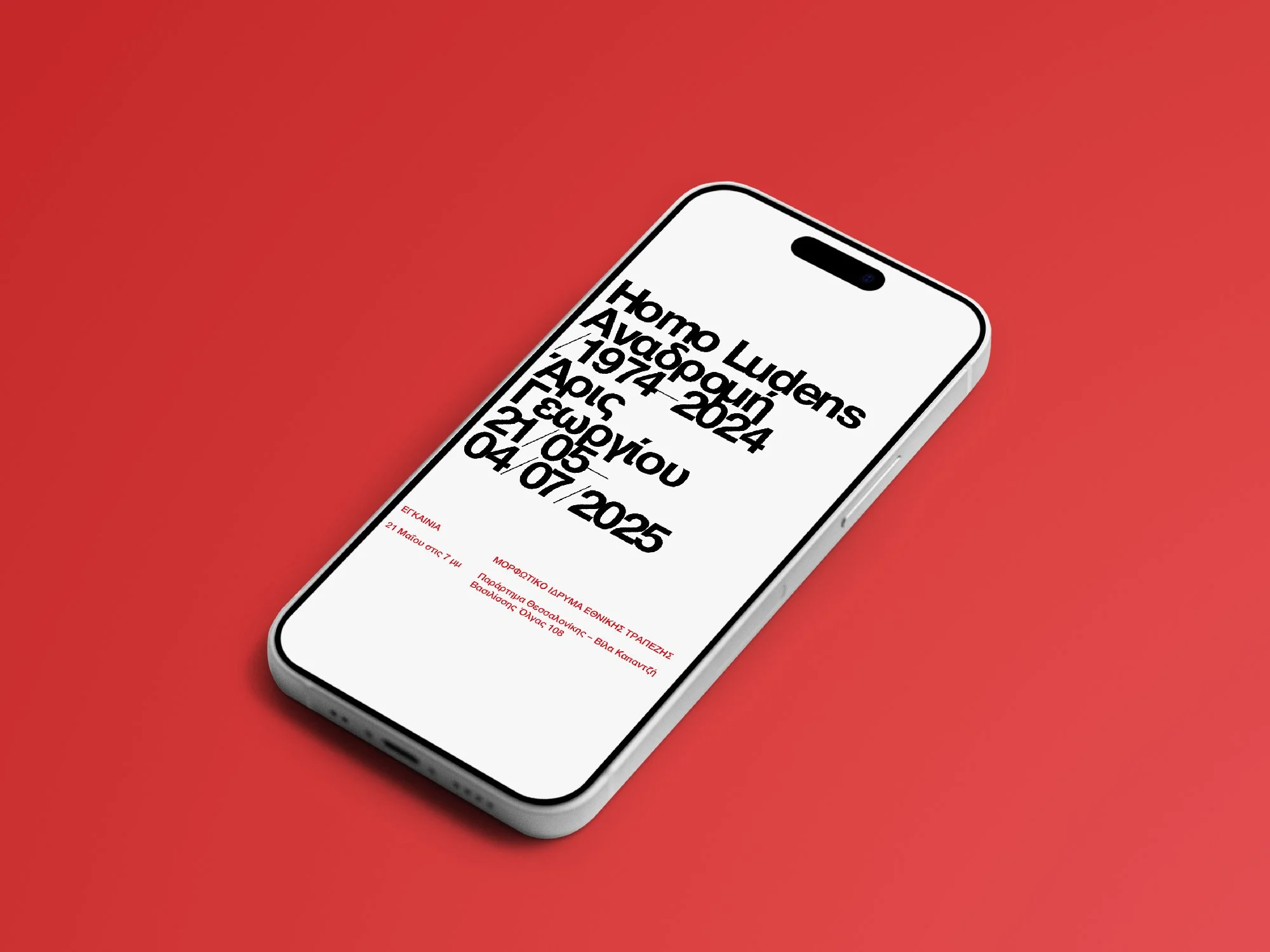
Based on this idea, the exhibition’s visual identity utilises a typography system that intentionally breaks the rules of proper kerning (the space between letters), adding a sense of tension and unease along with an increased expressiveness. While minimising the presence of further elements, a high contrast colour palette — consisting of white, black, and bright red (Georgiou’s most characteristic colour, prevalent throughout his work) — was chosen in order to both accentuate and complement the above deviation.