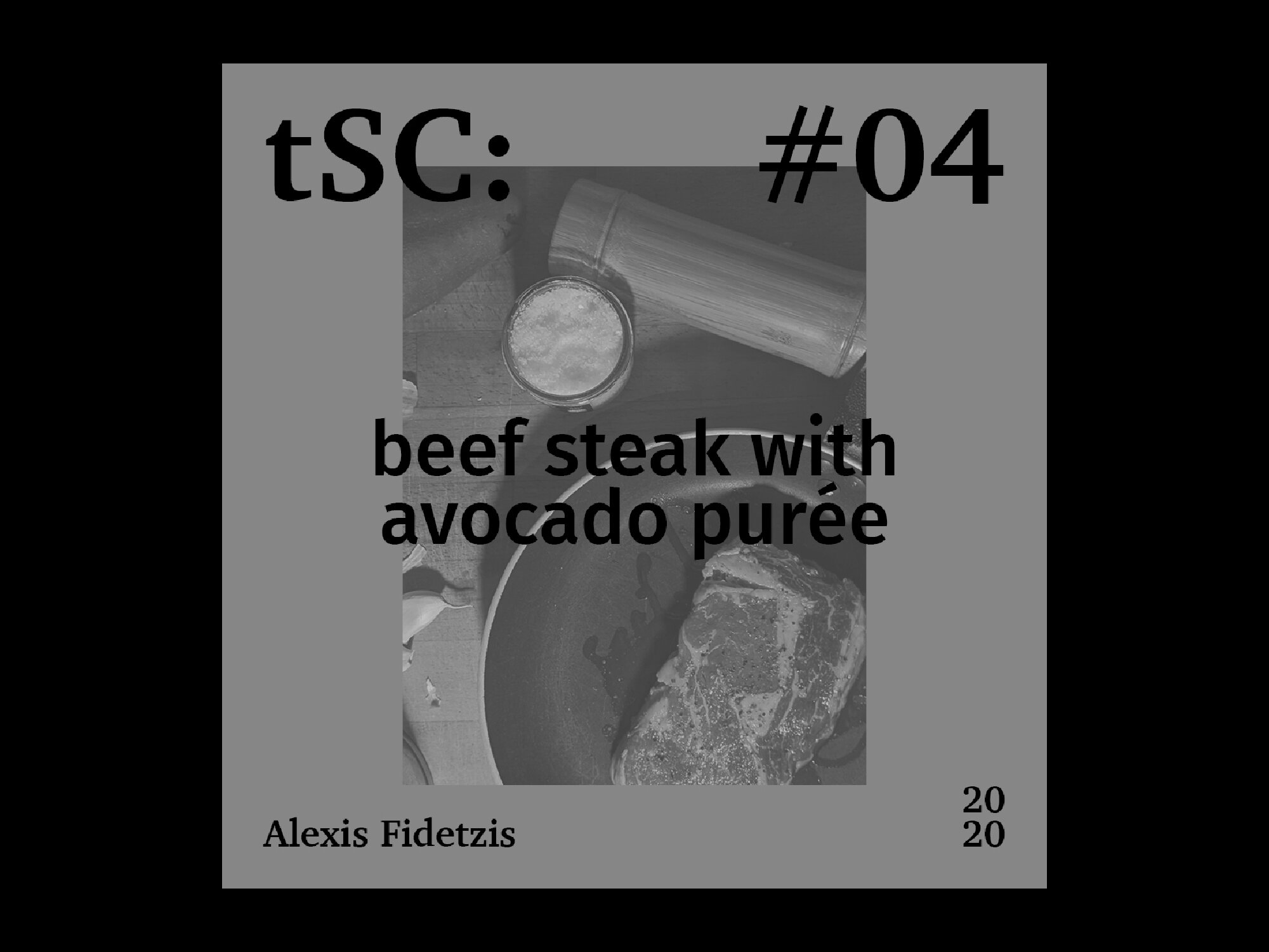
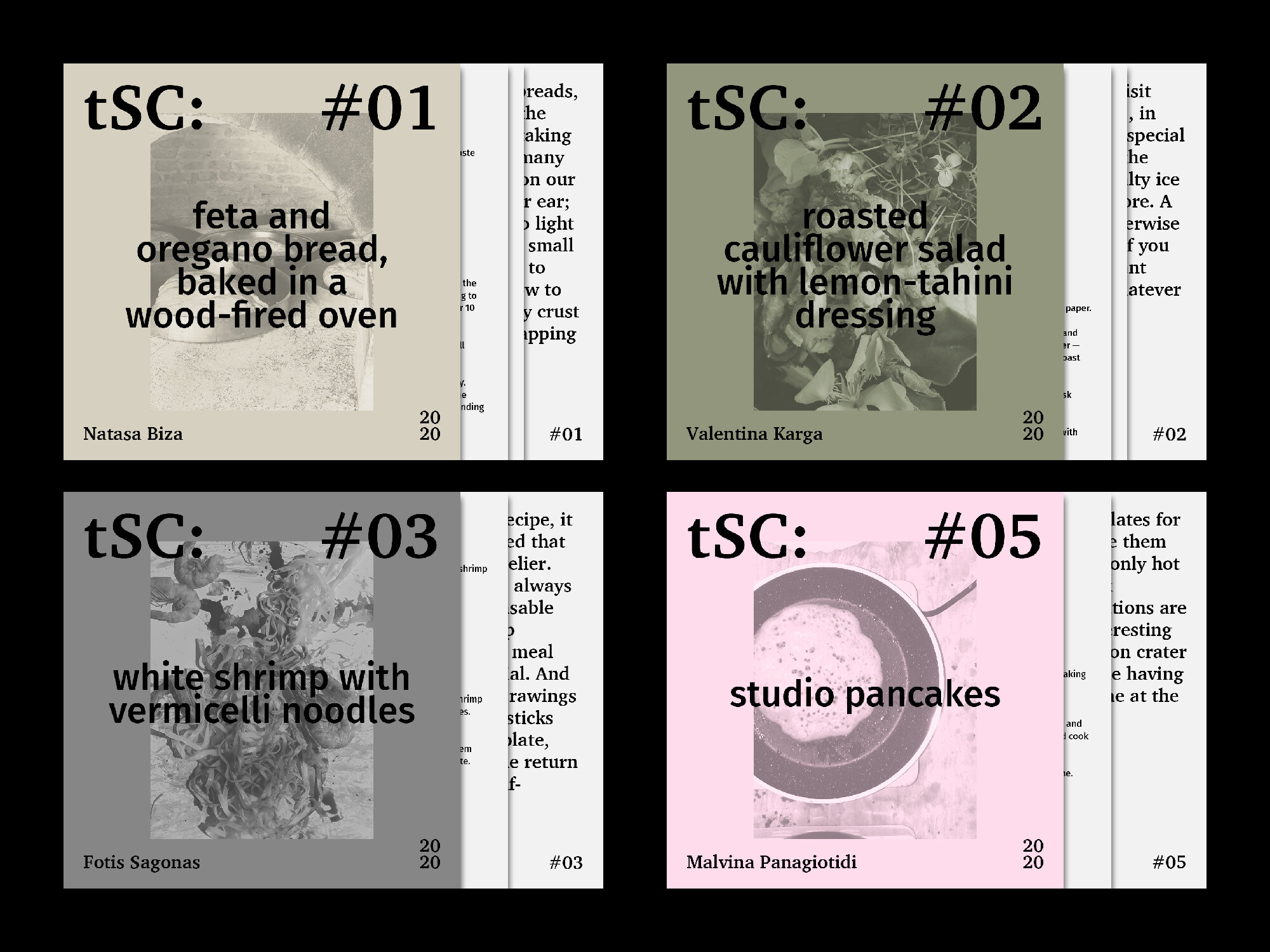
For the visual identity that we created for the project, which includes a mark and a design system through which the posts are made, we used bold typographic forms, bearing in mind the platform’s call for functionality in smaller screen sizes. The implemented typefaces are both serif and sans in order to reflect the numerous pairings present within the project, such as food and art, old and new or local and global. Furthermore, the identity was based on a colour-coded system so as to organise the contributed recipes into four basic categories: breads/appetisers, soups/salads, main dishes and desserts.